SOSO Coffee by Design & Creative Associates Co., Ltd
”SOSO coffee” is located on the first floor of a condominium in Hochiminh City, Vietnam. It is located in a housing development area where many wealthy Vietnamese and foreigners live. It is located in a housing development area where many wealthy Vietnamese and foreigners live.
The client, a Vietnamese owner, loved Japan so much. All she requested was a Japanese-style and elegant space, and the rest was left to me. However, I understood that it is the client's request to focus on the spirituality of the Japanese people and the beauty of the spatial expression based on it, rather than the so-called "Japanese style”.
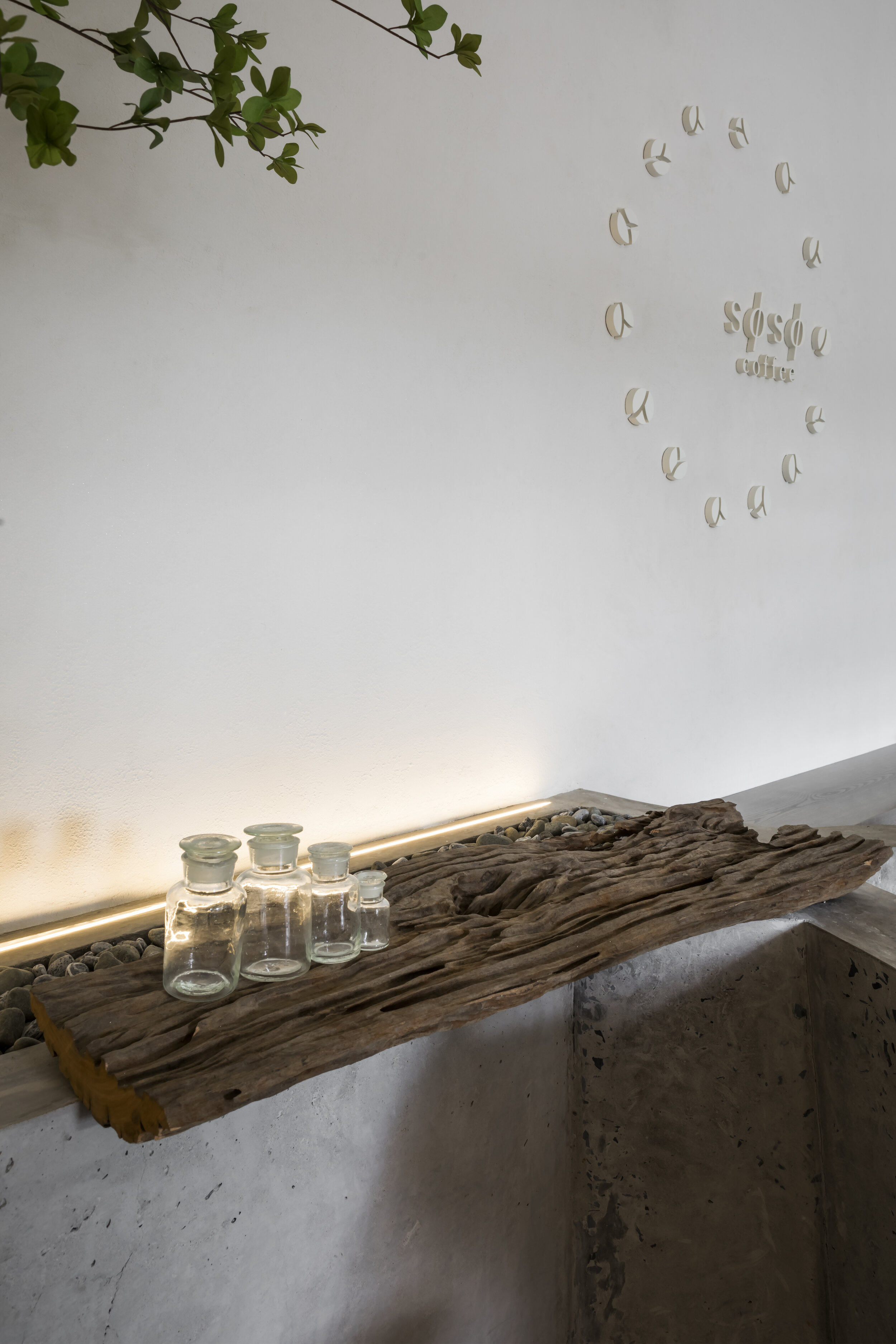
The name of the store, SOSO, is derived from the Japanese word “楚々(SOSO)”, which means pure, beautiful and delicate. That's why I decided to imagine and assemble a Japanese space that fits the word.
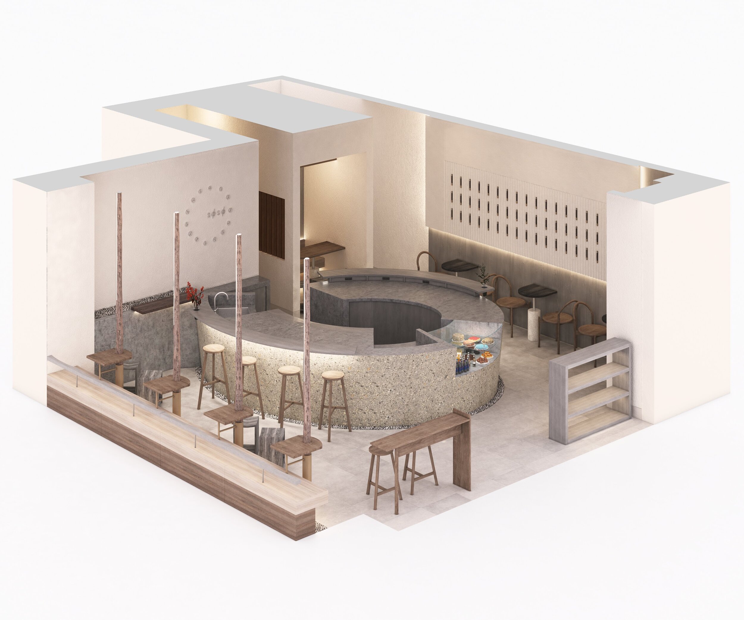
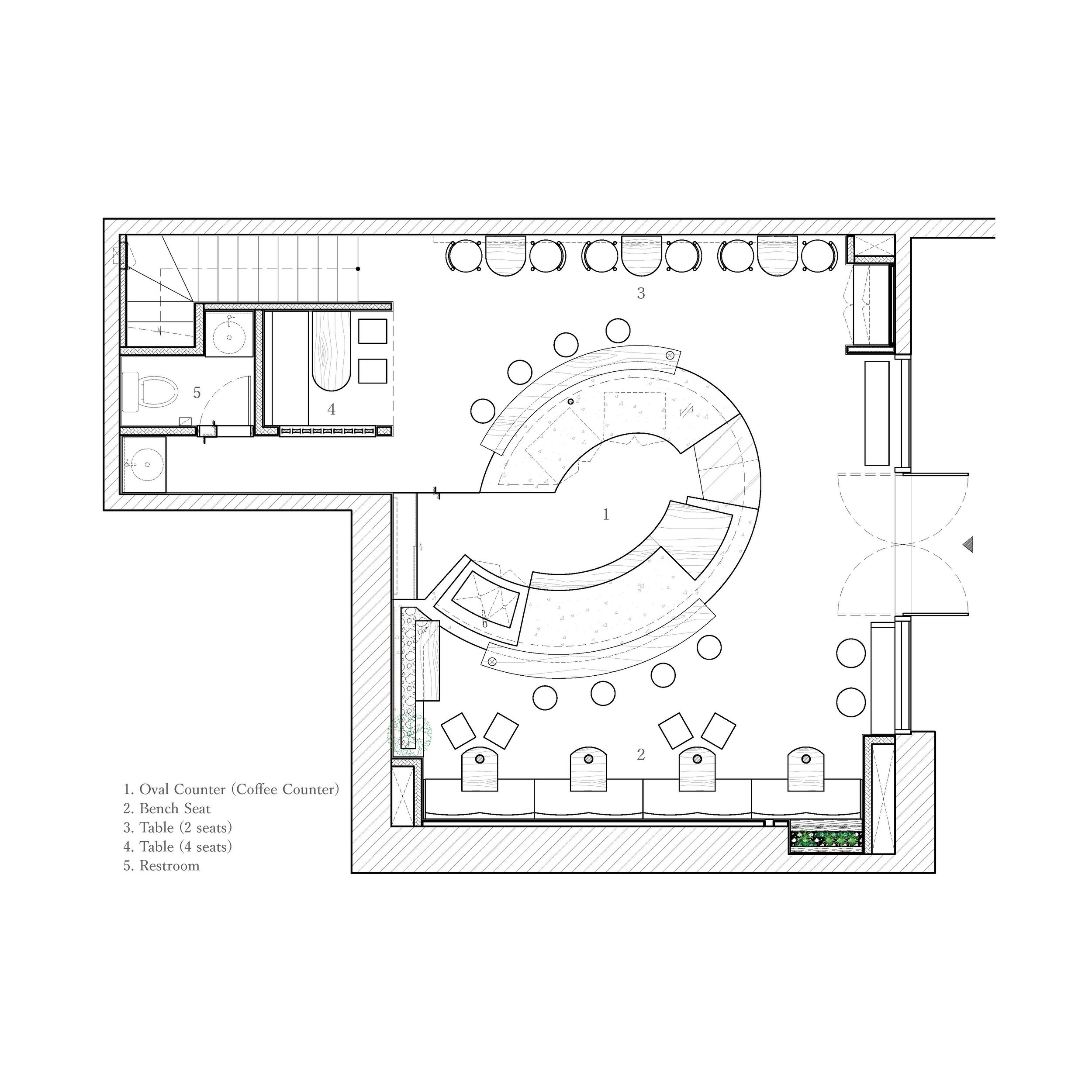
The store is about 40 m2 excluding the toilet and stairs, which is not so large. To secure the number of seats effectively, it is common practice to place the counter near the wall and use the rest as customer seats. However, instead of focusing solely on efficiency, I thought that a spacious and laid-back space like the Saigon River flowing nearby would be more suitable here.
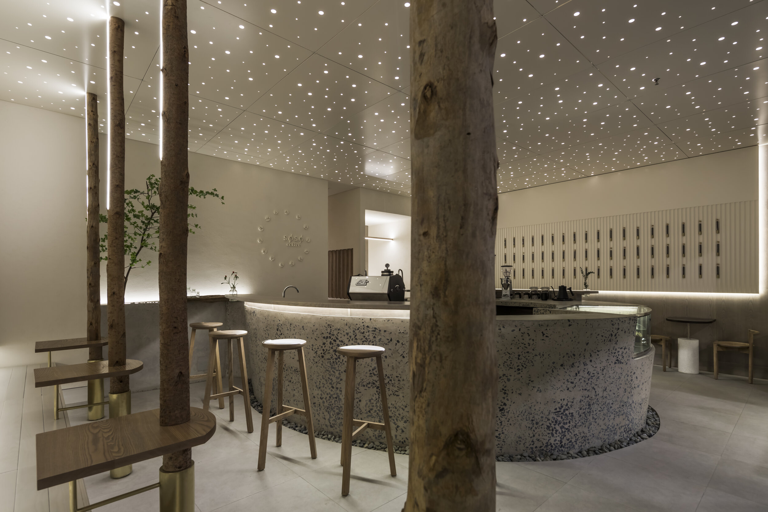
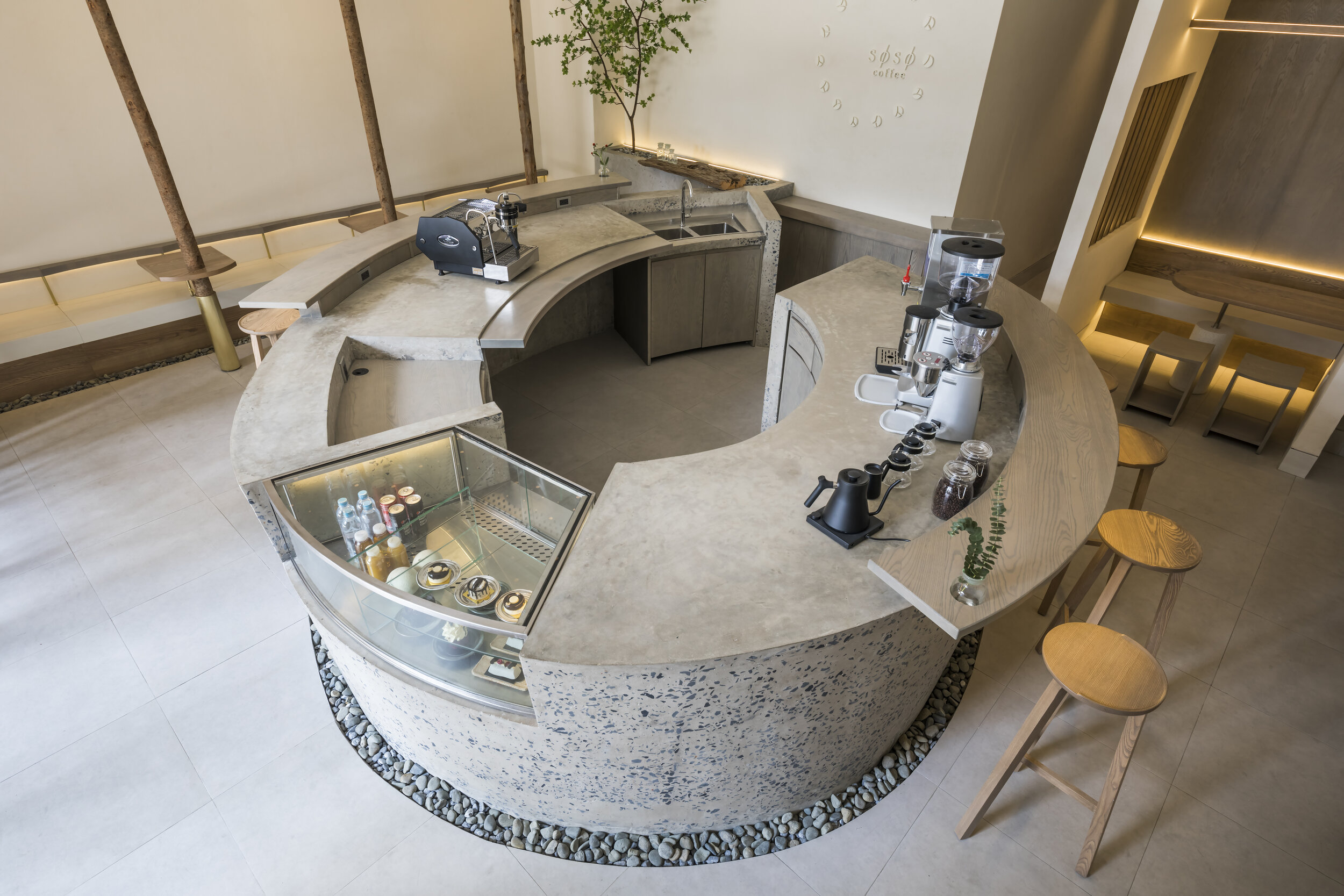
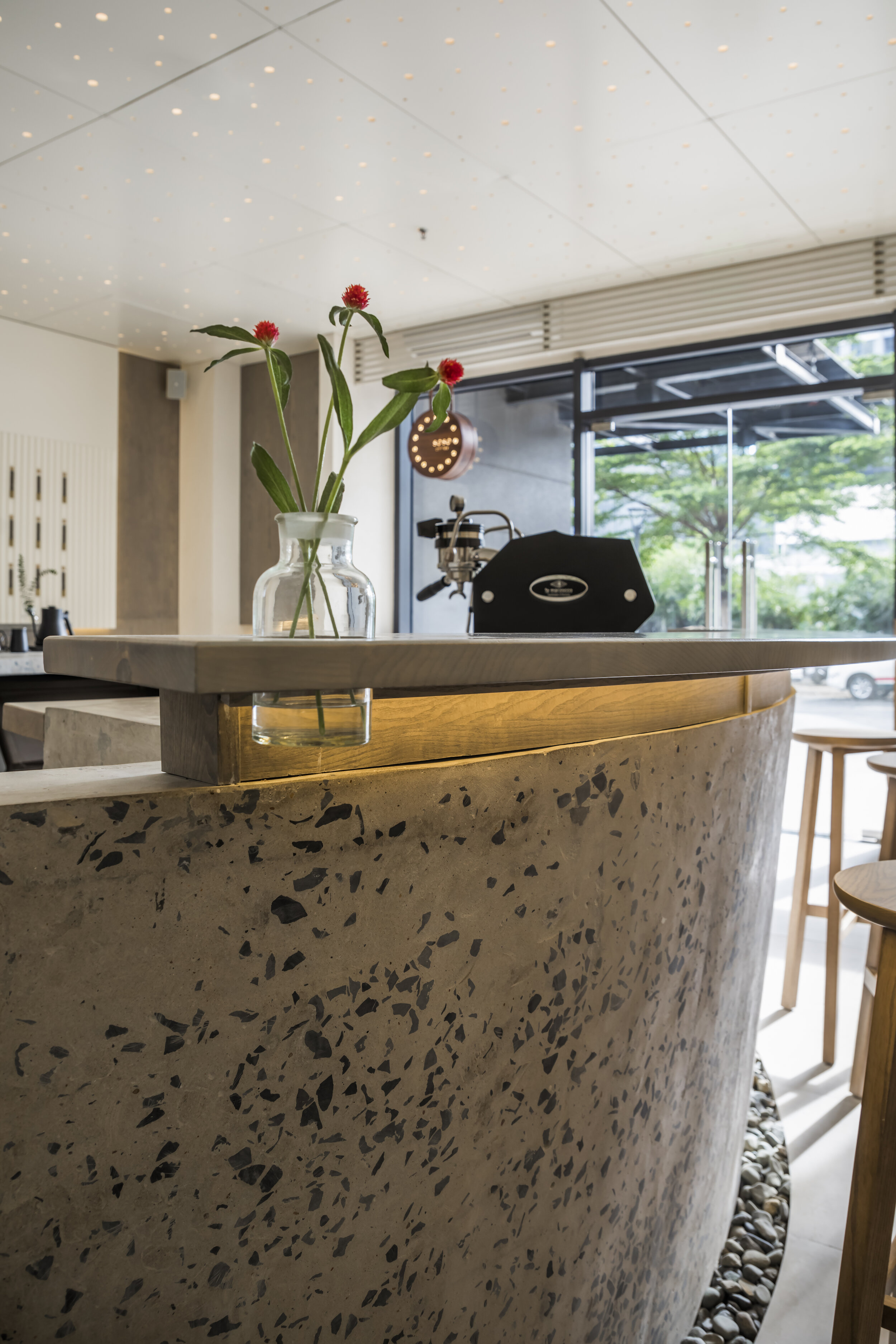
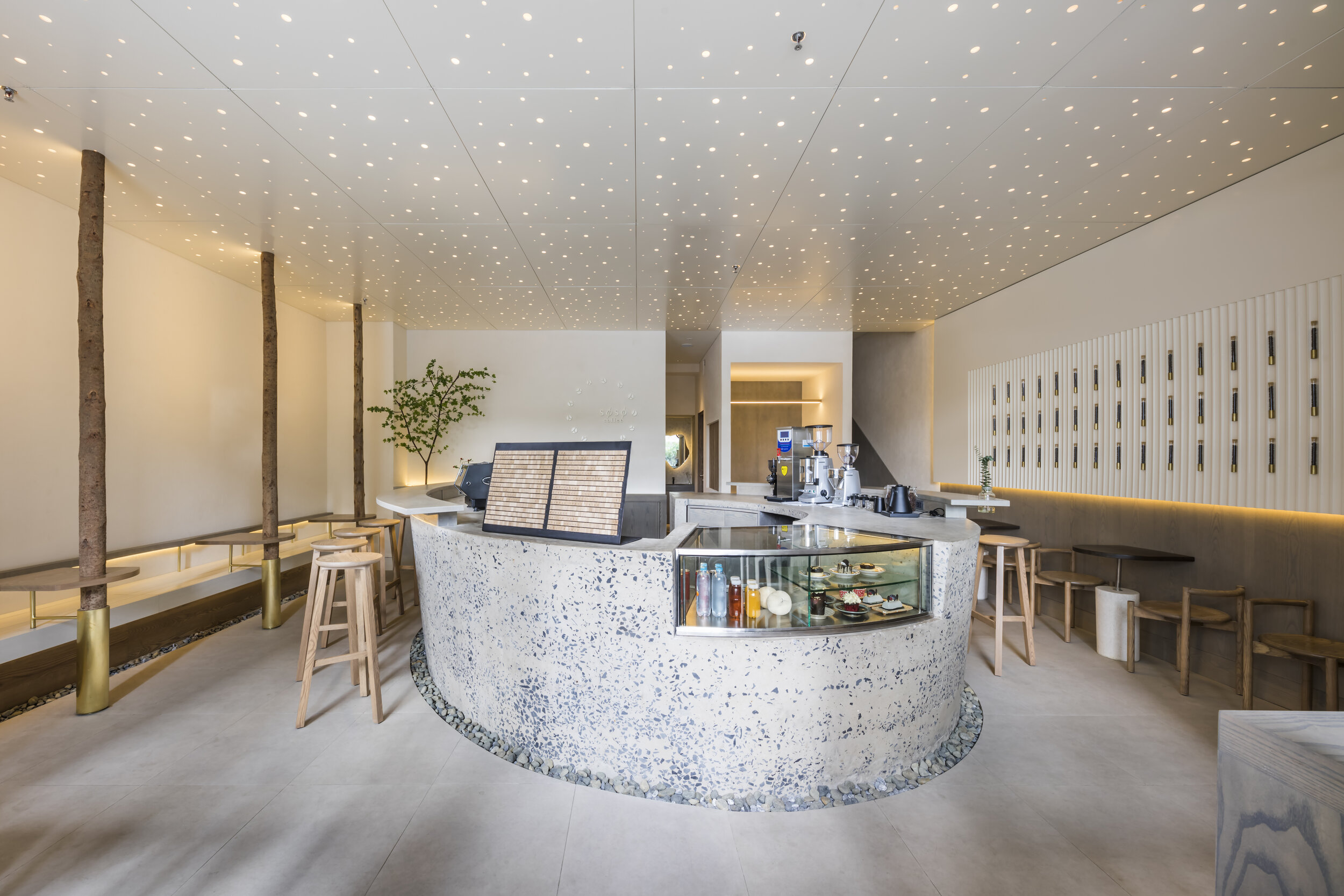
Therefore, I decided to place a large oval counter in the center of the cafe and place a table in the extra space around it. When a visitor enters the store, he first places an order through the counter, which approaches the entrance, and from there, they naturally move left and right along the oval to be seated.
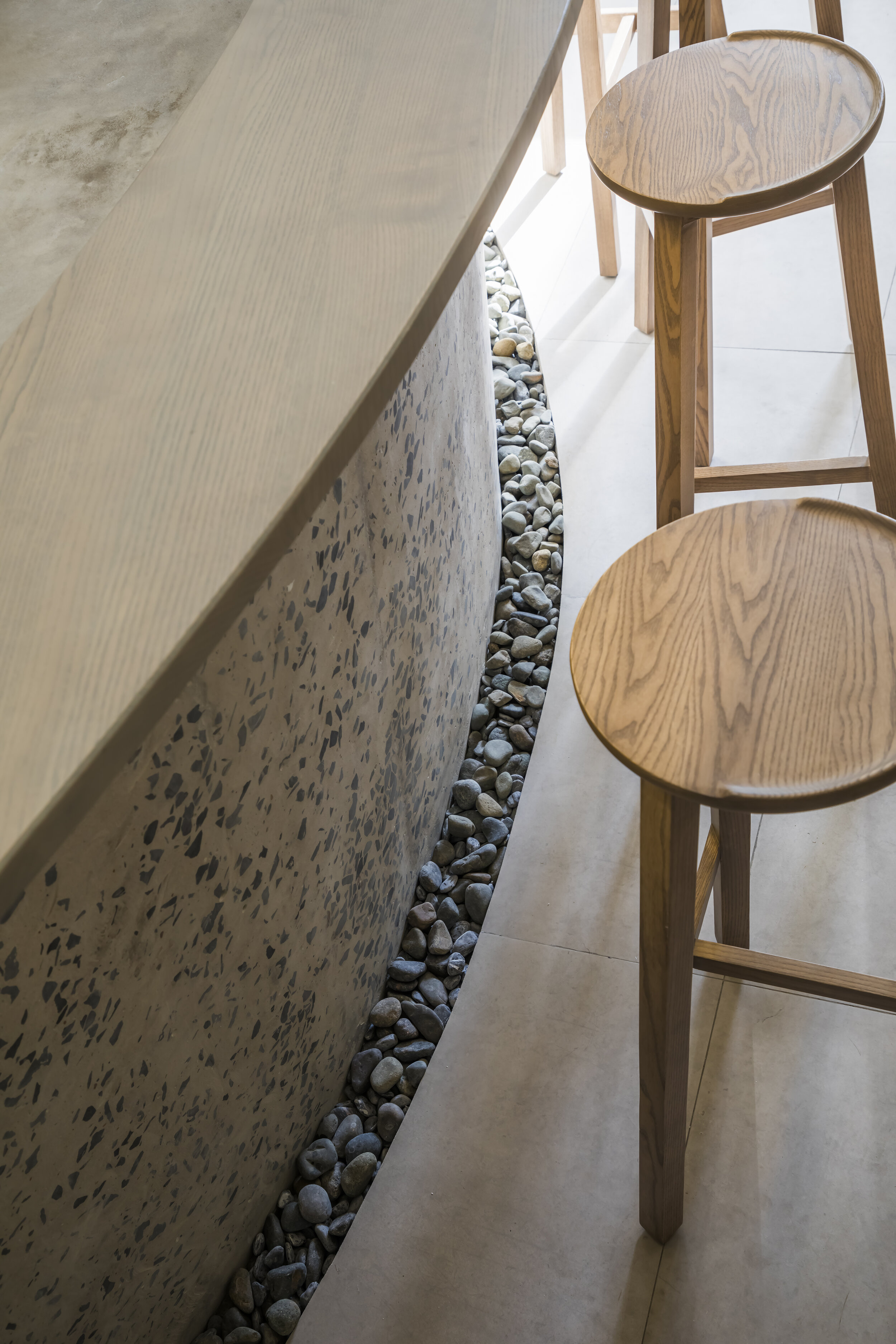
The counter is integrally molded with cast-in-place concrete. Only the side surface is sharpened to expose the crushed stone of the aggregate, and the finish is separated by the edge with the top plate surface. By giving concrete a careful finish like applying it to furniture, it has come to have a new look from the original strength and rough look of concrete.
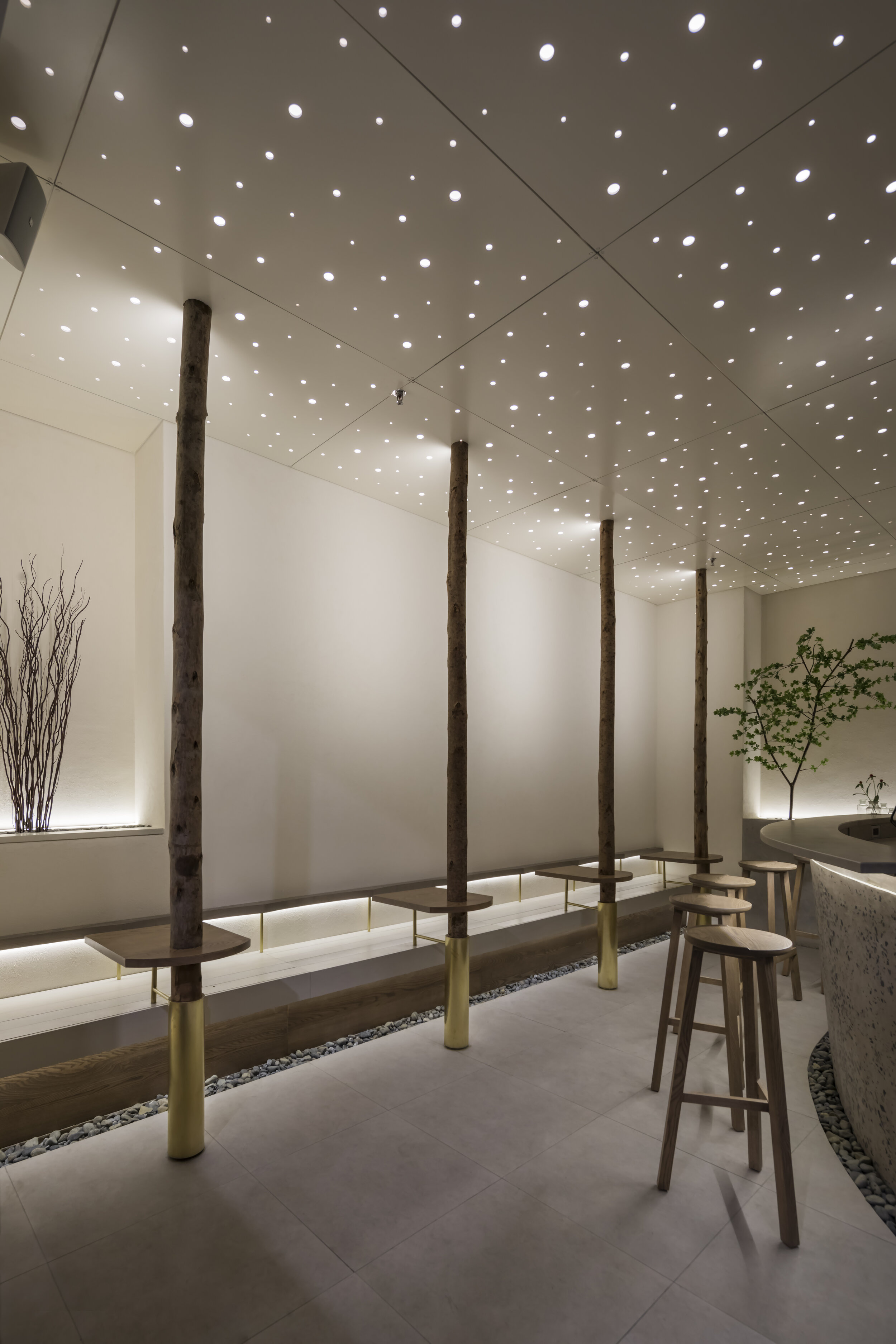
On the bench along the wall, logs with skin integrated with the table are lined up like a grove, and the legs are supported by brass cylinders to give a clean and sharp impression. Brass, which is still shining now, should become more astringent and familiar with the space over time. The tape light fitted in the log emits light toward the wall, and the reflected light gently illuminates the inside of the store.
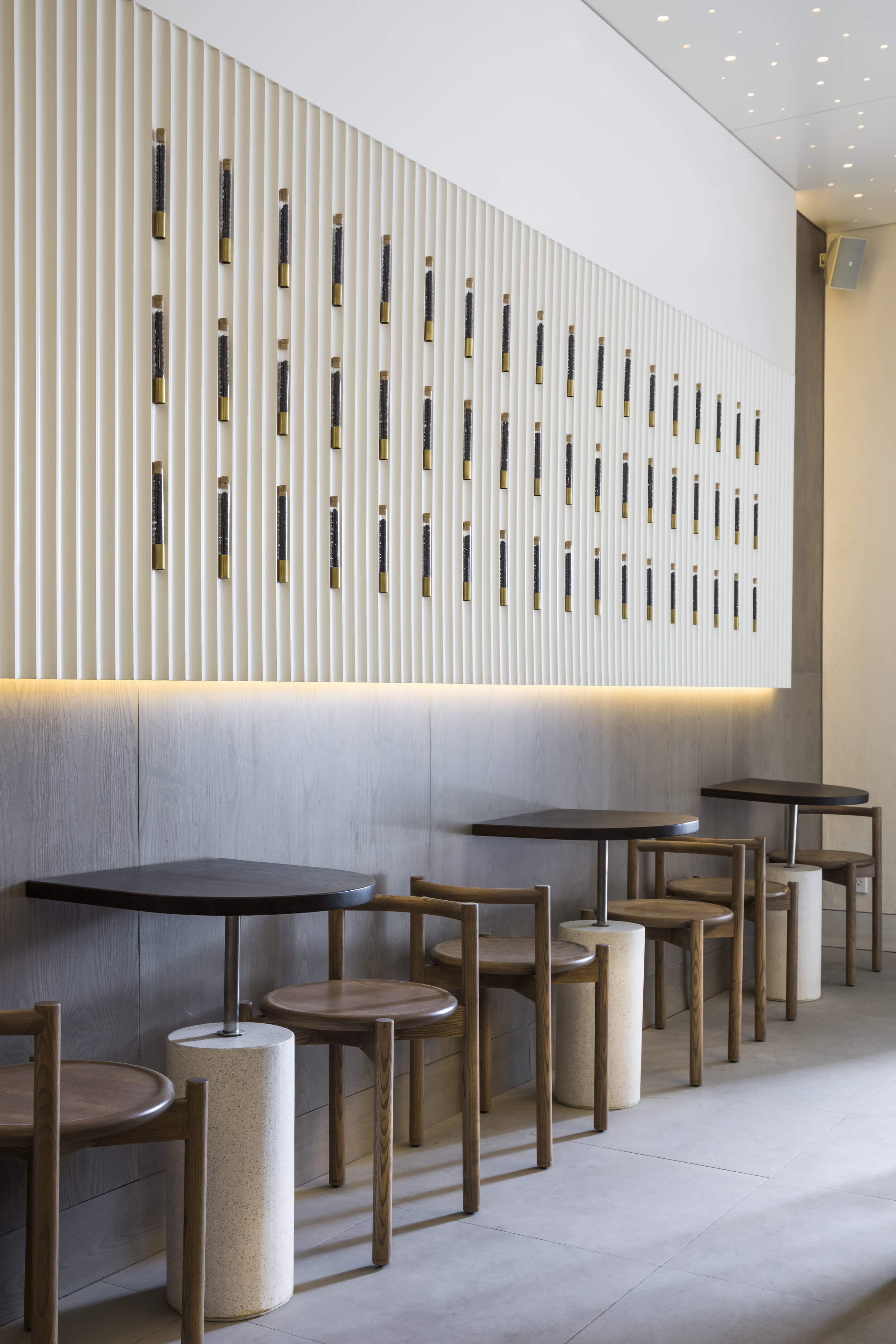
The wood used for the furniture and walls is painted in four different colors: white, gray, brown, and black, with a thin coat of paint to show the wood’s grain and preserve the expression of the wood.
The ceiling is covered with panels with innumerable holes randomly drilled. The faint light that leaks from the hole makes the store look like it is surrounded by white snow, and at night it looks like a starry sky. It became a space with different facial expressions throughout the day.
Drawing/ Planning
website: http://dreamcomesasia.com
