
Hangzhou Vanke Liangzhu BIRLAND designed by Fun Connection Design (China)
Birland, located in Liangzhu cultural village, Hangzhou, is an artistic commercial complex designed for micro-vacations. As the final piece of the commercial puzzle, it not only meets the increasing daily consumption demands of the villagers, enhancing the attractiveness and convenience of the residential area,Continuously attracting visitors from the Yangtze River Delta with high-quality cultural, artistic, and design content, Birland appeals to a group of micro-vacationers who have long admired the lifestyle represented by Liangzhu.
Fun connection has employed a variety of design techniques to create a vibrant commercial atmosphere in Birland, gradually injecting more commercial ambiance and vitality into the suburban vacation setting at different levels.


Considering different business formats and commercial atmosphere of each area, comprehensive suggestions have been provided for exterior areas,By appropriately and strategically integrating outdoor seating into overall planning, the boundary between wild nature and artificial environment has been eliminated.
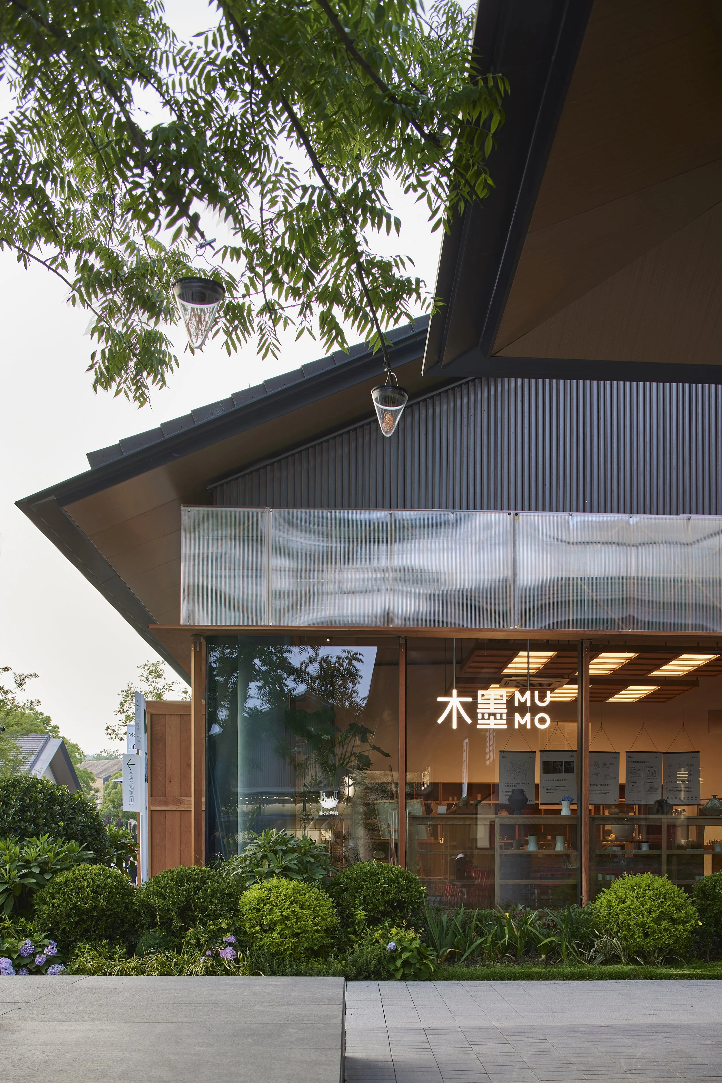
Birland has introduced nearly a hundred brands, creating a distinctive commercial project through non-standard customization.Traditional brand visual expression merely focued on storefront sign. How to strike a balance between the diverse brands identity and the context of Birland? Fun connection acts as an invisible hand, orchestrating and coordinating the facade designs of different brands in Birland.
Funconnection breaks down the dimensions of facade commercial design into smaller components. All the stores has been micromanaged, from typography design for storefront sign to materials, colors, installations, lighting, and even providing suggestions for facade materials, visual design, and furnishing for both indoor and outdoor spaces. A truly symbiotic relationship between nature and art in the everyday life of Liangzhu is built by focusing on the details.
The logo of Birland is derived from the “Jade Bird”, a cultural relic discovered from the Liangzhu archaeological site. It is composed of four simple and flat circular patterns, forming an abstract representation of the “Jade Bird.” The core of the brand has been reinforced by applying logo to singage, urban furniture and atmospheric ornaments all around the streets.
Later, the logo will serve as the creative theme for the plaza and park in the core area. Significant symbols that shape the collective memory of the community will be created by extracting its design language and adopting different materials.
Funconnection further extends the logo in various ways. This includes transforming the flat form into a gradient 3D form or using color blocks as carriers to create different visual styles. Thus, the brand material for different areas, seasons, and mediums finally get done through reinterpreting the interestingness of the cultural symbols within the existing visual framework.
By infusing grand artistic and cultural elements into everyday visual symbols, branding seeks to promote in a non-traditional and indirect manner. In Birland, architecture, landscapes, spaces, visuals, installations, lighting, all become mediums of artistic expression, constituting an essential part of the brand. With its pleasant natural scenery and relaxing atmosphere, Birland offers a healing experience for everyone who is weary and stressed out.
Company Website: https://www.funconn.com/