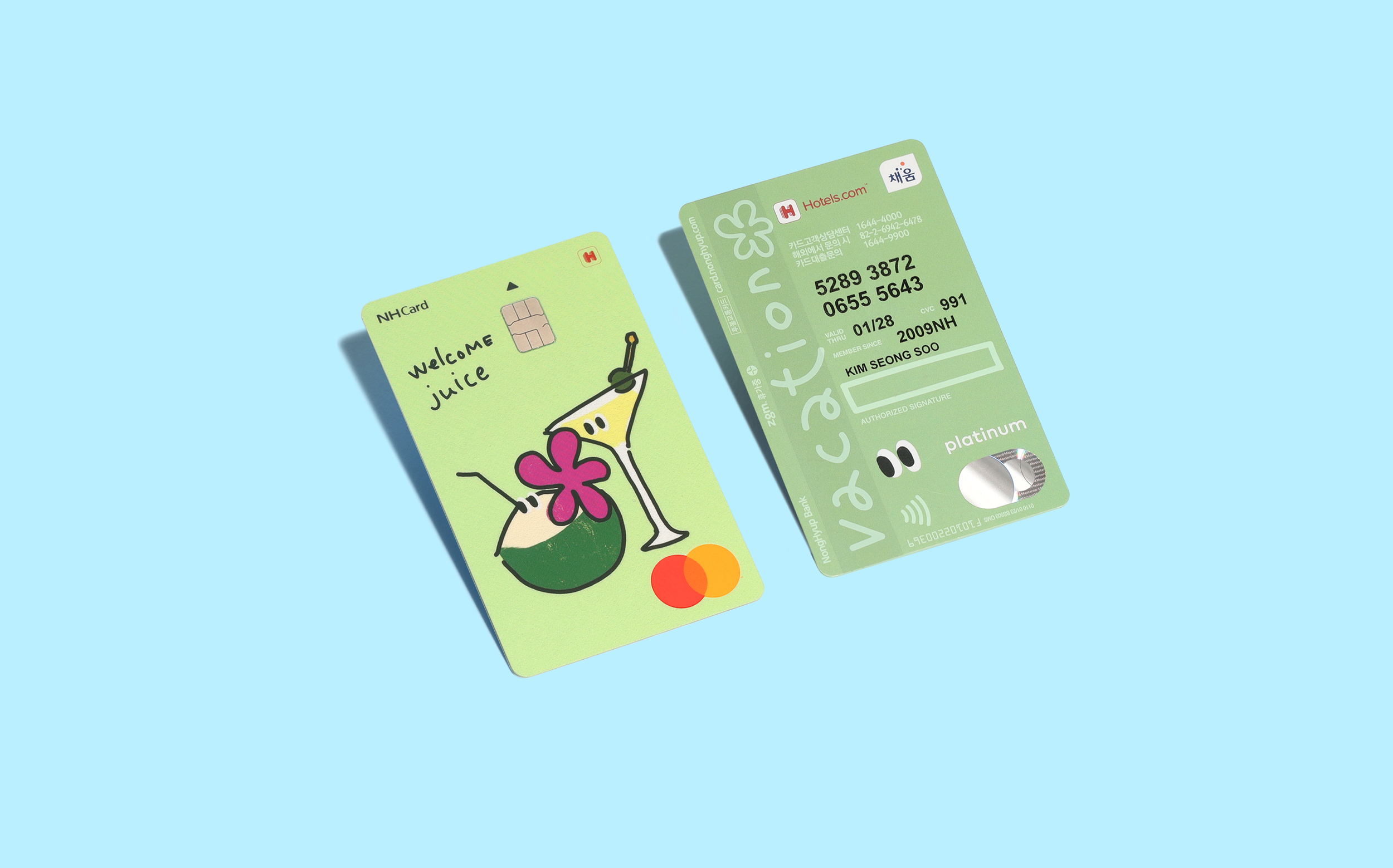
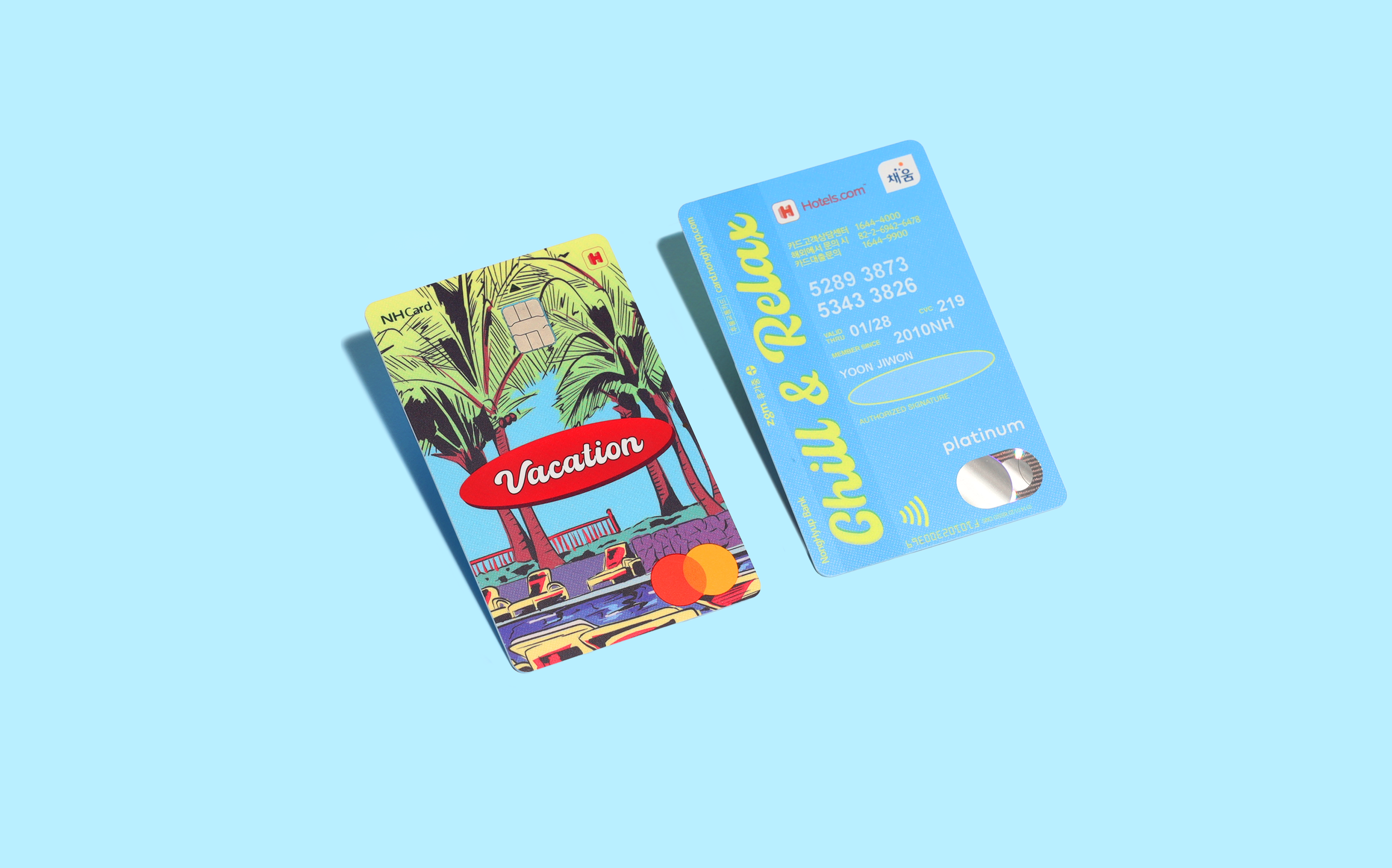
NH zgm.OnVacation Card designed by Double D (Korea)
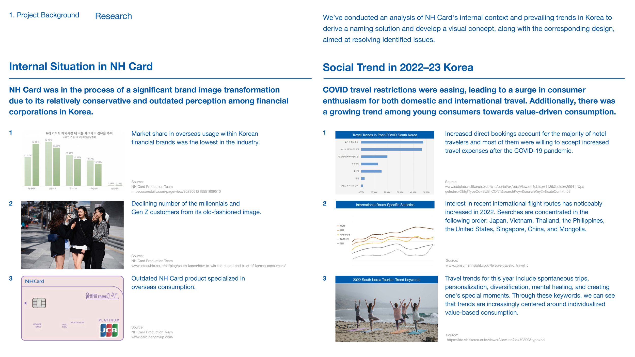
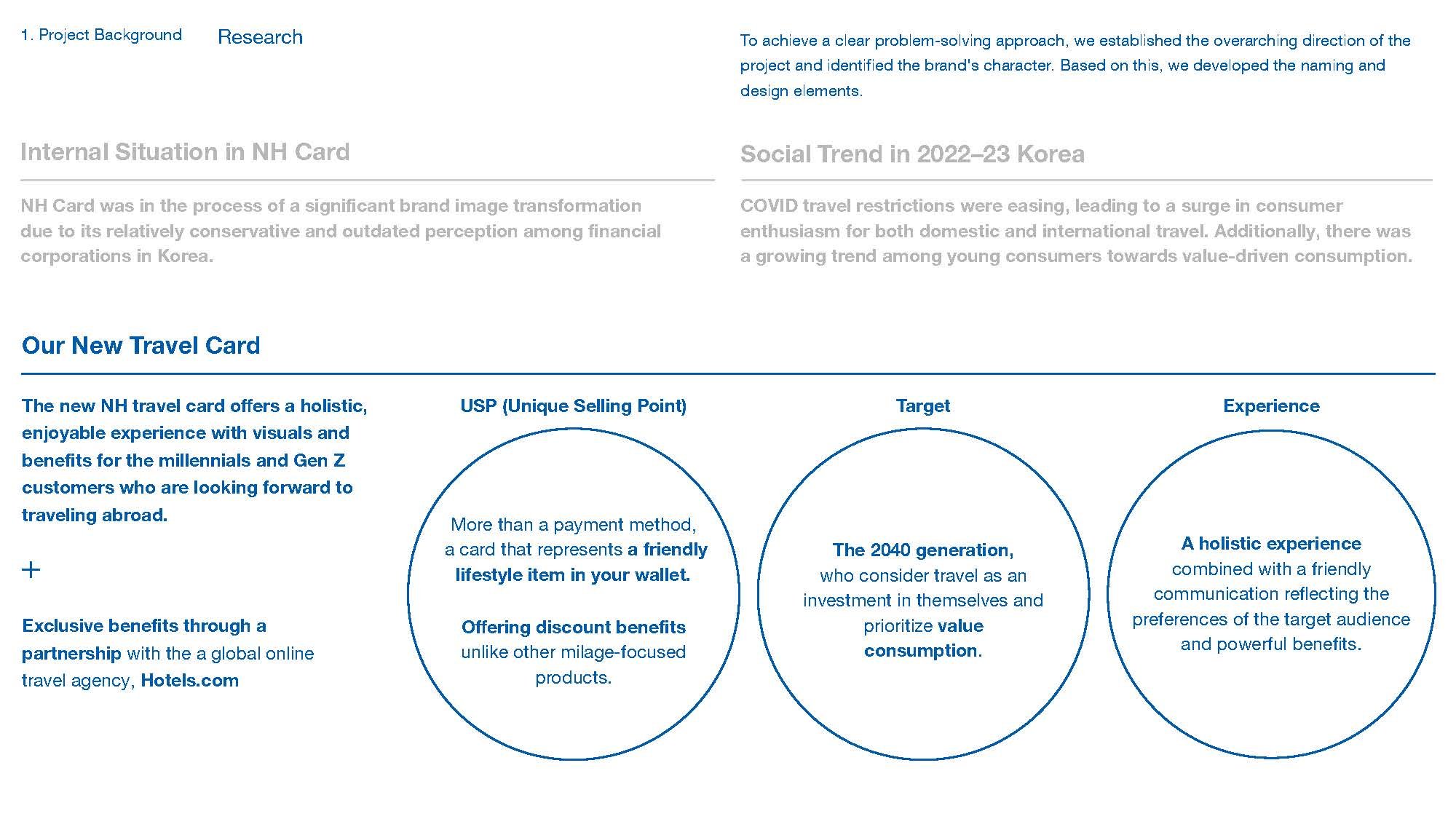
NH Card is a Korean financial service provider that was in need of an image transformation. By 2022, it found itself near the bottom of the industry in customer’s international spending and a declining number of the Millennials and Gen Z customers. Coupled with a growing number of young consumers interested in value consumption, the need for travel was rising, due to the ease of travel restrictions in Korea. NH Card decided to partner with Hotels.com, a global online travel agency, to launch a new overseas spending and traveling specialized product. To create a new holistic travel consumption experience, Double D was part of the project to develop the naming, card plate design, and marketing materials.
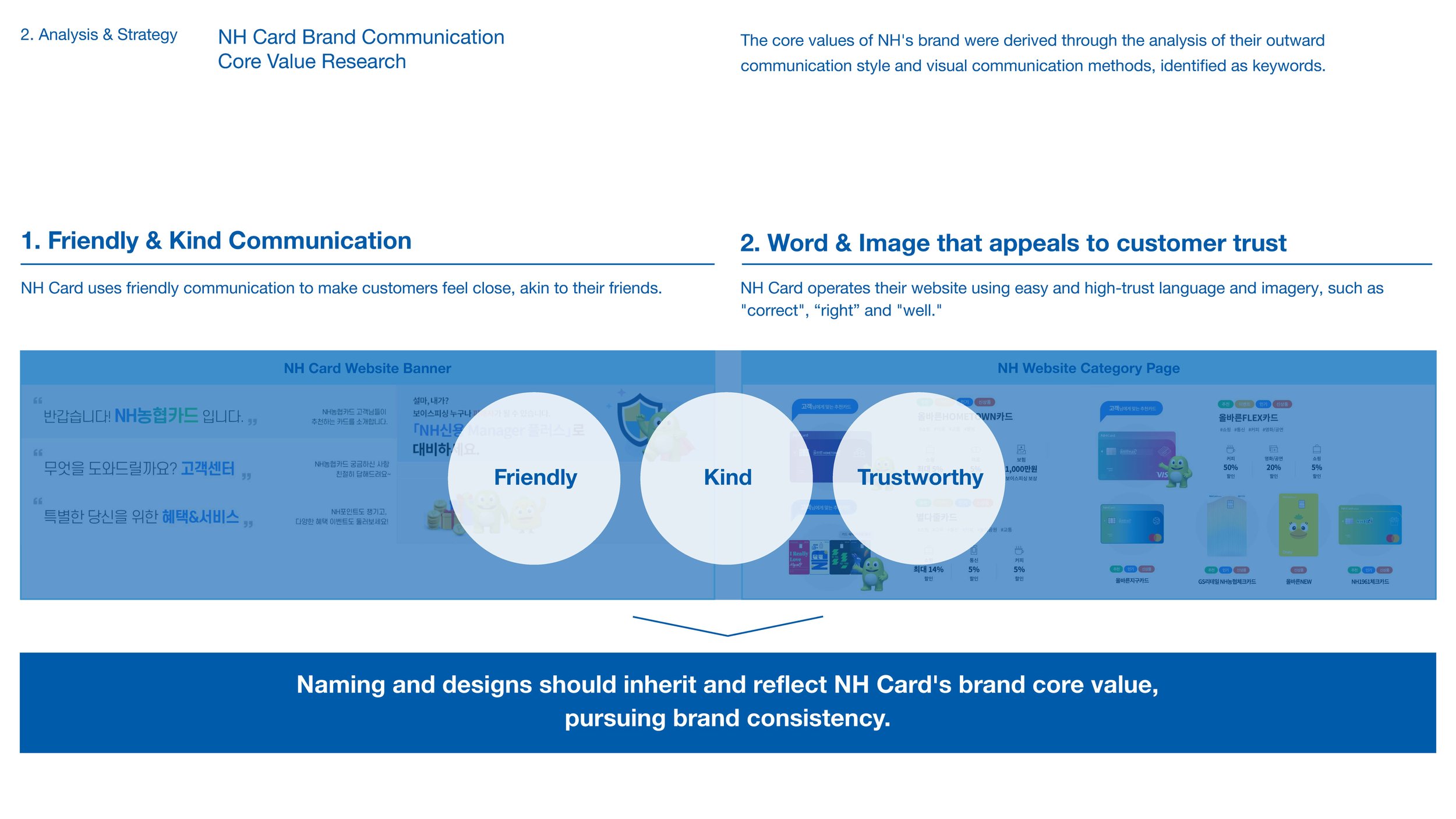
We focused on distinctive differentiation and the consistent brand communication to appeal to target customers who value diverse tastes and value consumption. Through our research, we learned that words like travel, mileage, and global—coupled with a prosaic airplane image—were overly used both domestically and globally in the industry. Based on this, we wanted to break away from simplicity and make a clear statement. Revolving around the main concept “the joy of travel you can relate to”, we chose “On-Vacation” for the naming inspired by the online status of office workers on vacation that busy modern people can easily relate to. We ended up with developing “zgm.OnVacation (translated to now.OnVacation)” as the name that resonates with consumers and separates itself from standard card archetypes, making it not just a payment method but a friendly lifestyle item in your wallet.


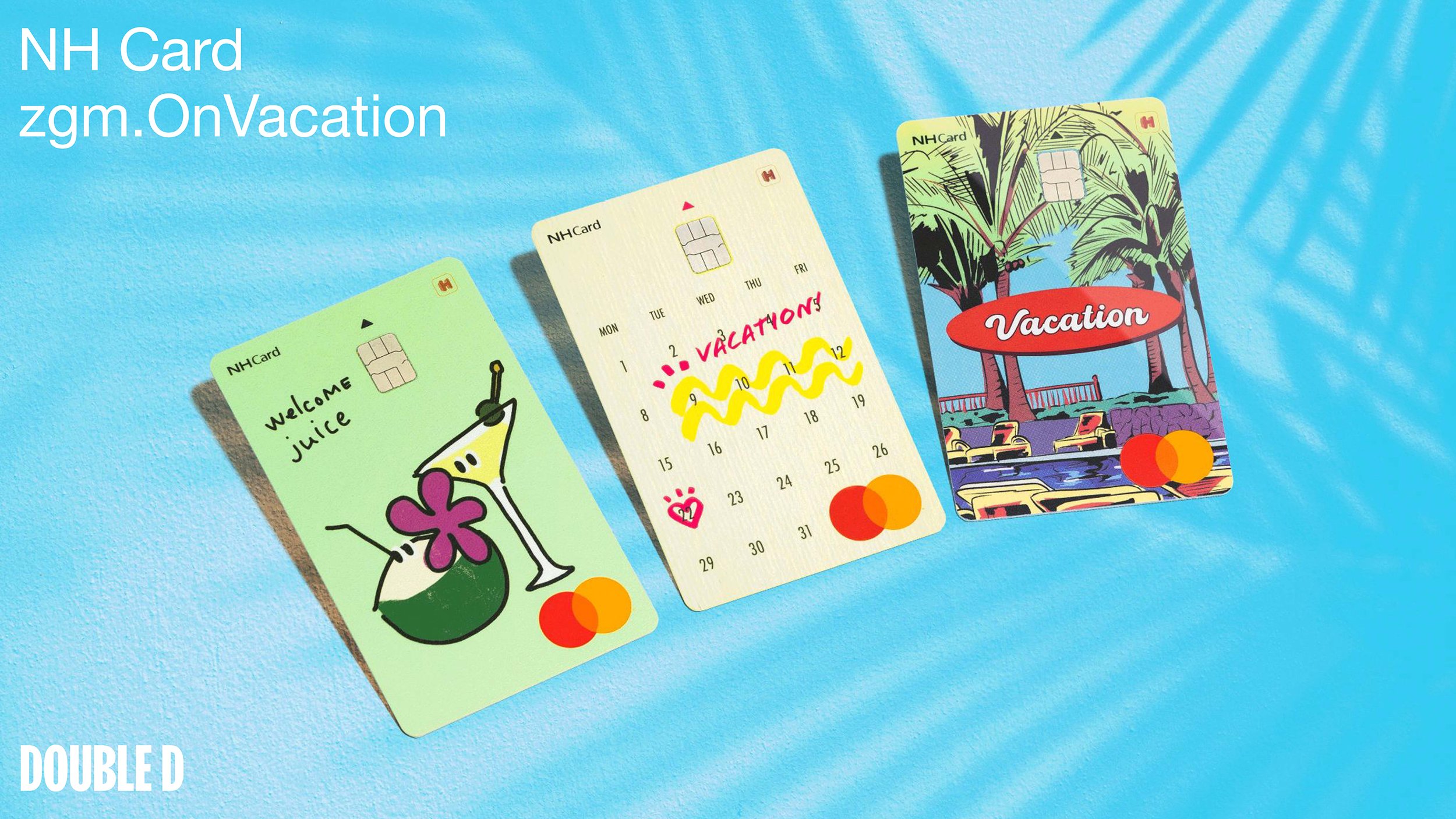
While developing, we have extended consistency in key visuals even to the back of the card, a space often overlooked in most card products. Until recently, practical restrictions during the card manufacturing process resulted in limitations on printing spot colors or designs on the entire backside of the card, which have led to less interest from the designers. With the advanced printing technology of the card manufacturing industry in Korea, we wanted to flip the perspective of the information area into an area where brand communication can be consistent through design. Furthermore, to cater the diverse preferences of the younger generation consumers, we provided 3 design options for them to choose: the first was a calendar on a paper textured plate that expresses anticipation with cheerful strokes marking the dates; the second was a character illustration of a welcome drink on a sandy textured plate; and the third was a vintage travel postcard illustration that reminds memories of past vacations. All of these communicated clearly and with millennials and Gen Zers on various social media platforms as well. As a result, we designed the concepts around naming, design, and benefits to be consistent, maximizing the value of each, and positioning the card to be a top-of-mind traveling card to customers.
The goal of this project was to break down consumer’s existing impressions of the brand. Launched in 1984, NH Card had not only had a stiffness and seriousness unique to financial brands to it but also a relatively conservative and old-fashioned feel compared to its competitors. The new card product focused on addressing concerns that existing perceptions of the brand might prevent people from using it even before checking out its exceptional benefits. We centered the overall direction of our communication strategy on one of NH Card’s core values: friendliness. The kind and friendly naming and visuals provided a great opportunity to break down perceptions of the brand that had been a barrier to engaging with younger consumers. A big achievement of this product was to invite customers to become interested in learning more about it and the experiences offered by NH Card, to relate to the overall narrative, and to have fun with it by breaking down barriers between the brand and customers.
In addition to departing from its old-fashioned image, NH Card achieved the following positive results commercially through this project: 20,000 zgm.OnVacation cards were issued within the month of launch and overseas spending increased more than 10 times compared to regular credit cards. On top of that, 91.1% of the cards issued were to new customers, significantly helping NH Bank and NH Card recruit new members in a short period of time. Furthermore, NH Card’s market share among partner businesses doubled from before the launch of this card, while the proportion of customers in their 20s and 30s increased by about 10% compared to the company’s previous card, thereby promoting the recruitment of young customers. The results also showed that the 3 cards had an even preference of ~30% each, indicating that we succeeded in developing products that cover a wide range of tastes.
*Data provided by NH Card
Website: https://studio-d-d.com/main/
