Beijing Langyuan Station . More Residence by LOD| Laliving and Opr Design
Communitopia: Relive memories - Weaving history, space and neighborhood together!
More Residence | Beijing Langyuan Station
Transform an old textile factory into a boutique apartment hotel that weaves the neighborhood with its past, present and future!
Design Concept
Most people's impressions of a city can be connected to a moment: a street scene, light and shadow casting by trees, detail constituting by a vivid scene or the participation of people in activities. Can we find a familiarity of lifestyle in the urban space?
In urban revitalization process, it is more direct and effective to demolish and rebuild than to retain and regenerate. How can we keep the original traces in the history of place that are related to people's emotion and memory?
Through on-site study and analysis, it is hoped that new urban residents can explore and rediscover the worldliness of the city. This project aims at weaving history, space and neighborhood together
The original building structure for More Residence Beijing Langyuan Station is an old textile factory from 1970's that has been abandoned for years. The design is to use the weaving concept to transform this old textile factory into a boutique apartment hotel that weaves the neighborhood with its past, present and future.
The concept "A Weaving Story...Weaving a Story of the past and future with MORE Community" aims to reconnect and relive memories of the place by weaving history, space and neighborhood together.
Project Overview
The project is located at No. 53, Banjieta Village, Chaoyang District, Beijing. The site area is about 2,080㎡ with 1,250㎡ of building area and 506㎡ of landscape.The total construction area is 3,820m2 with total of 112 guest rooms and around 220m2 of public space.
Building Facade
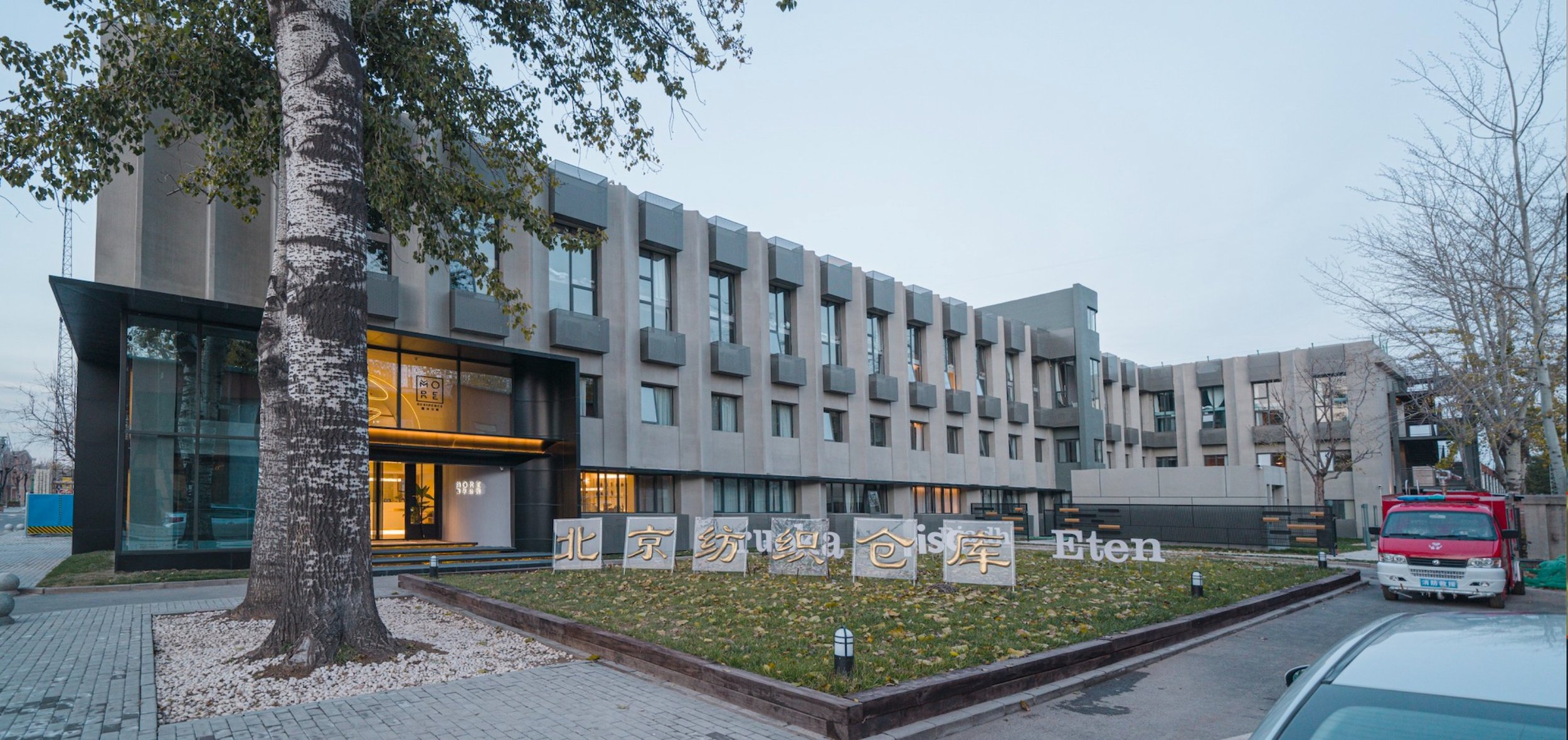
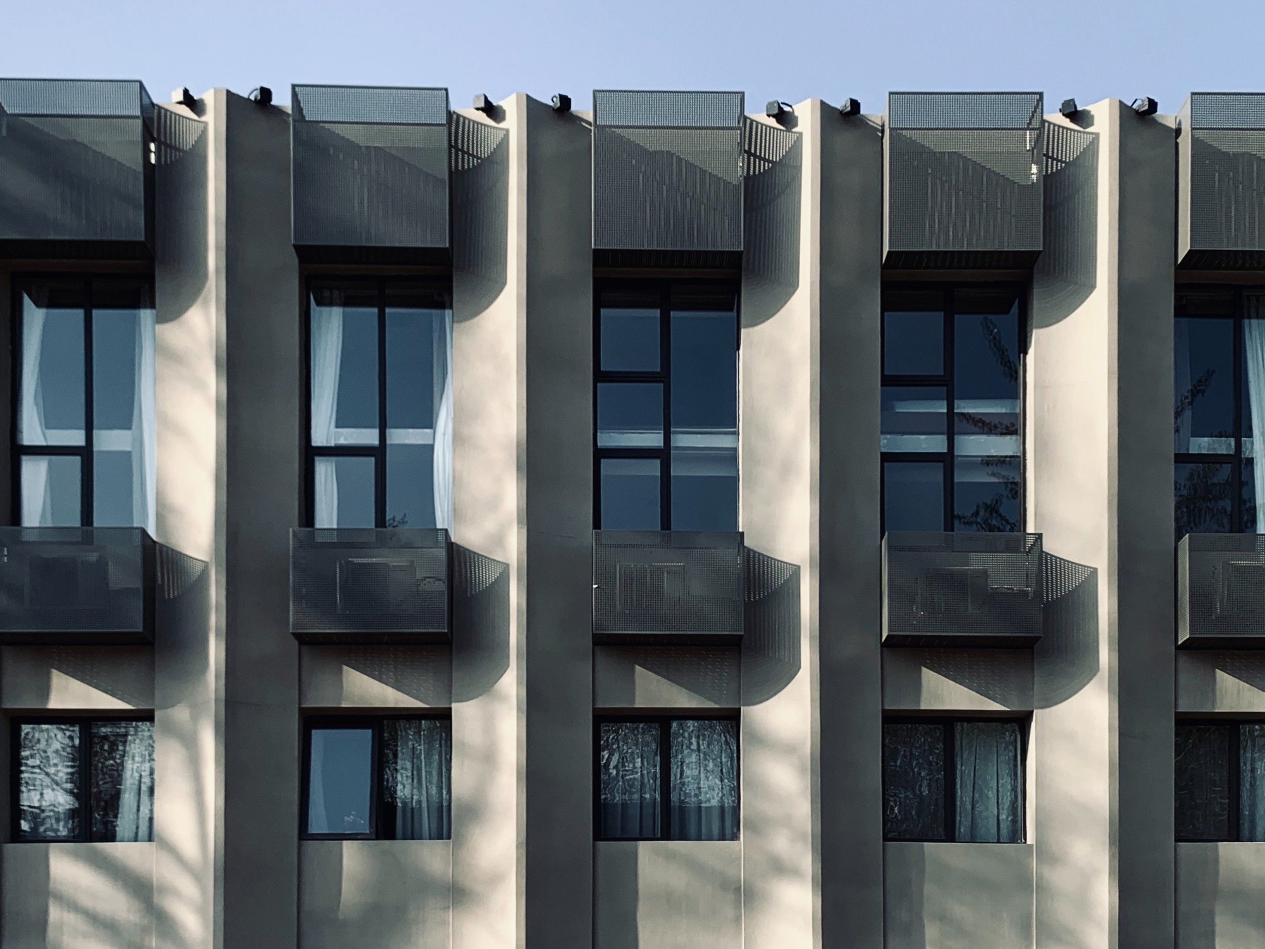
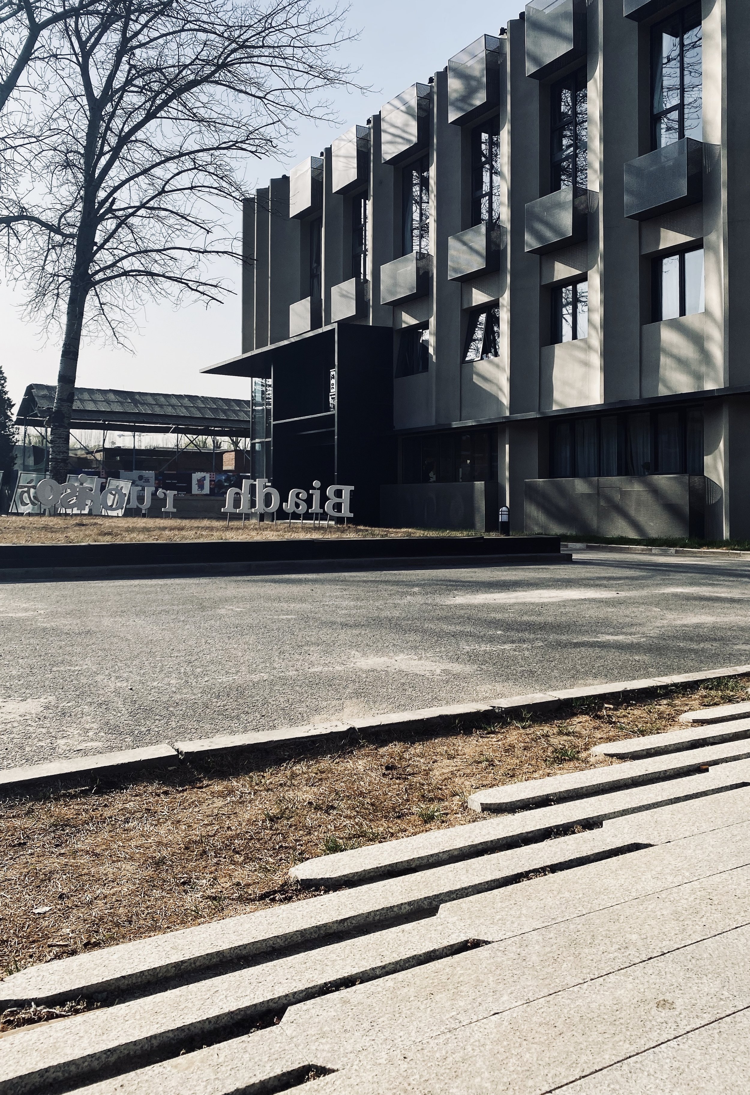
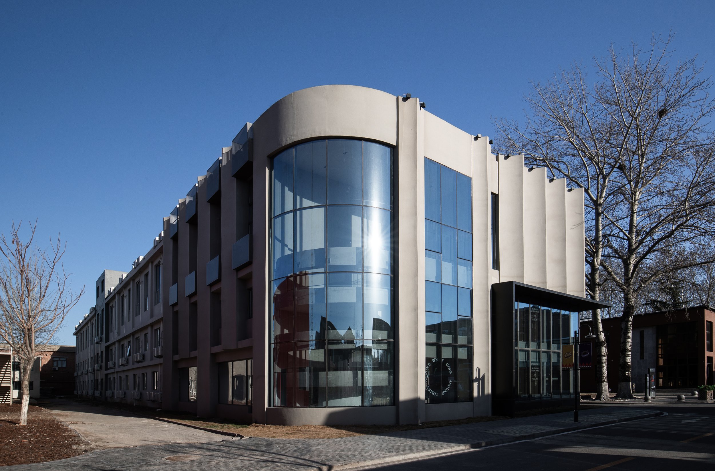
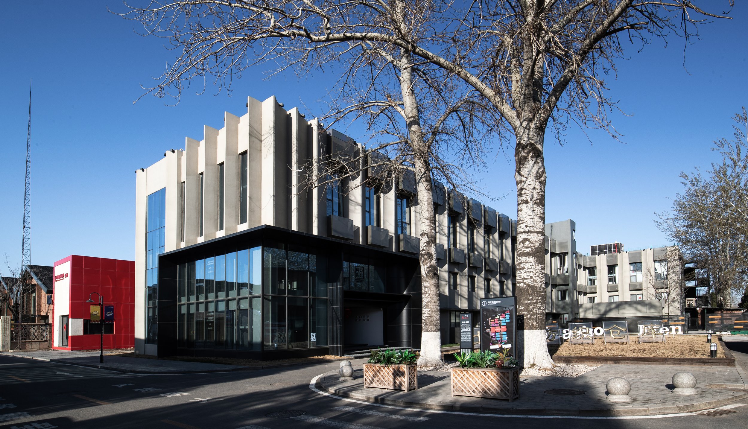
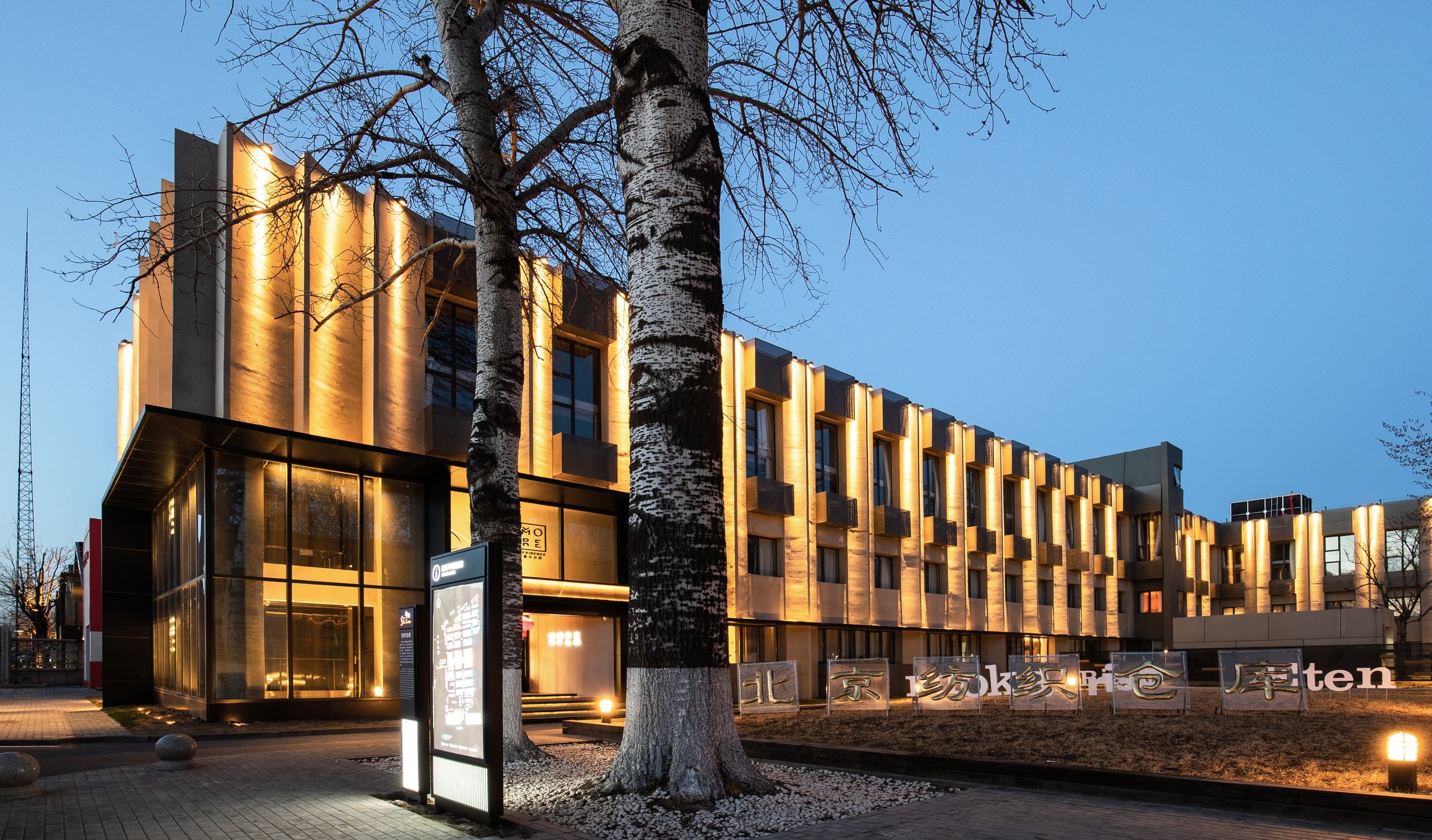
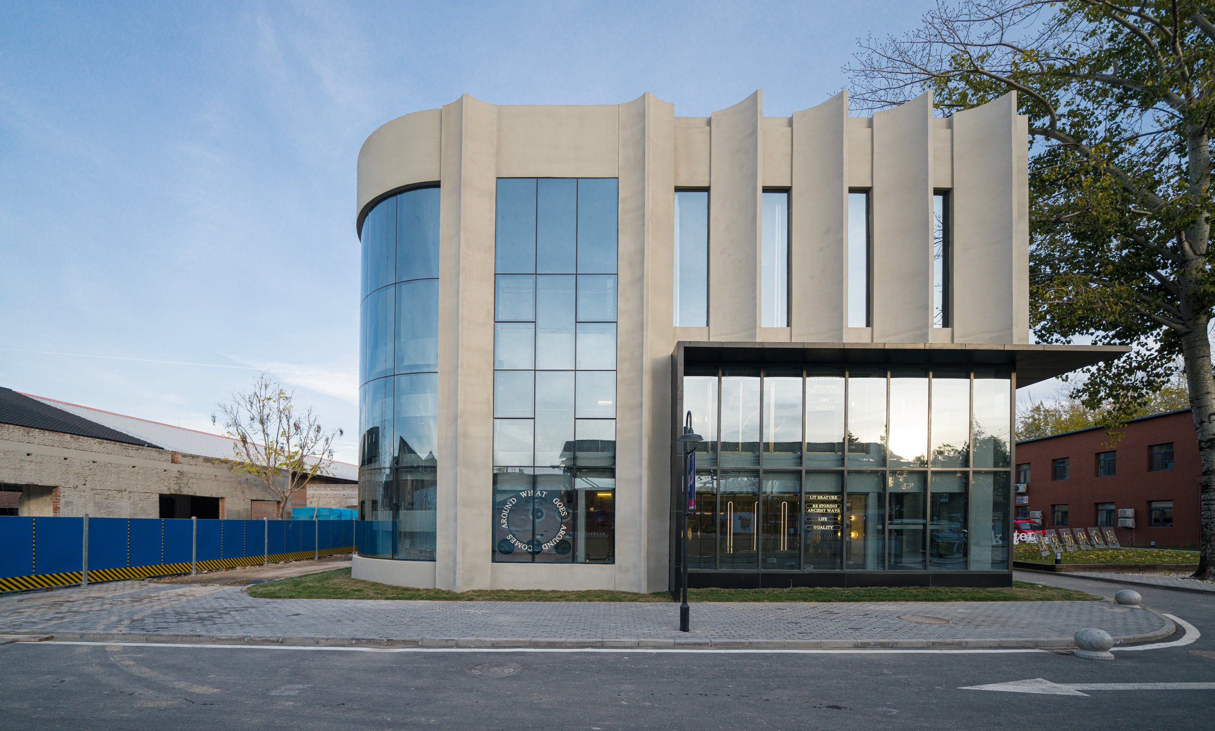
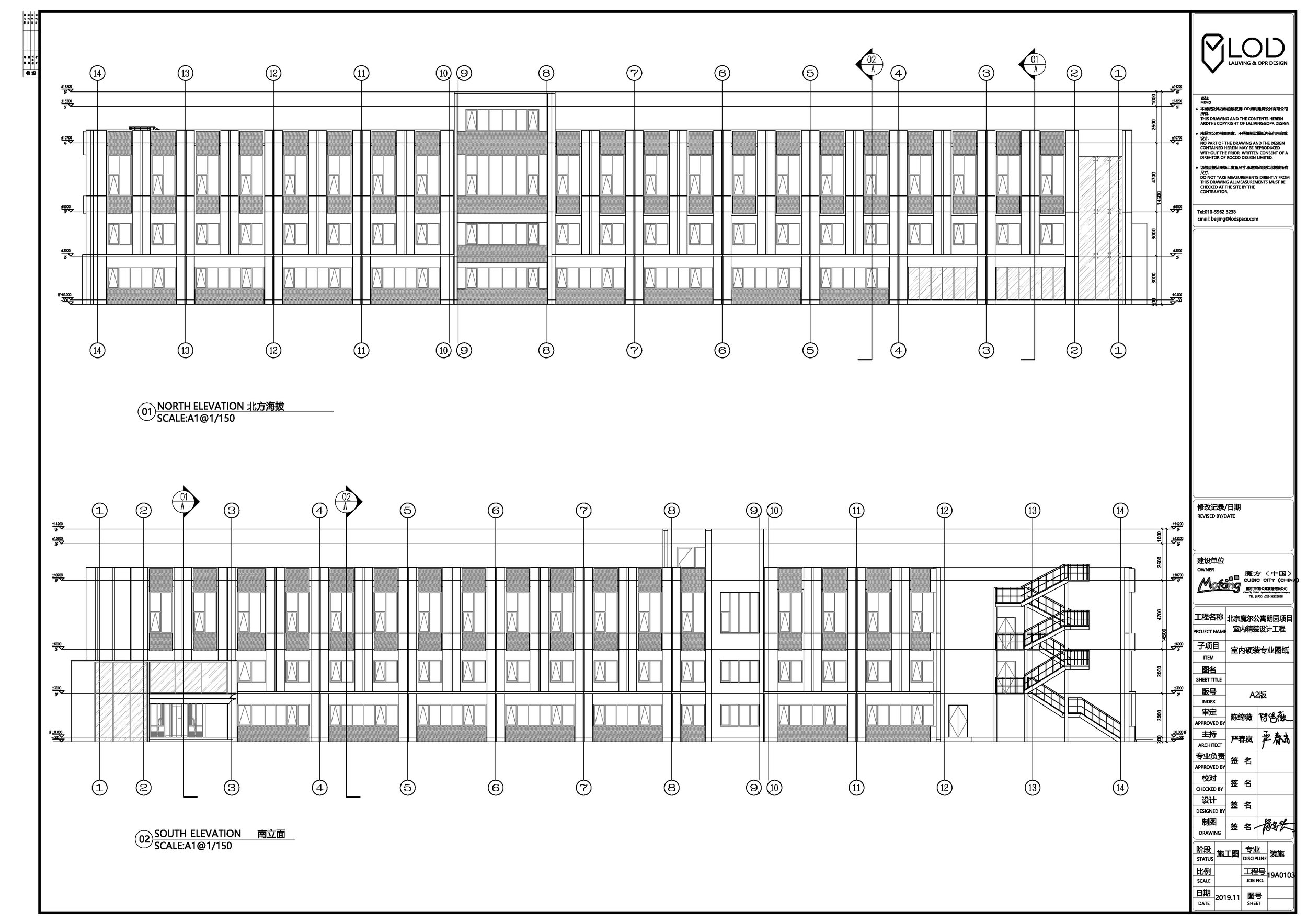
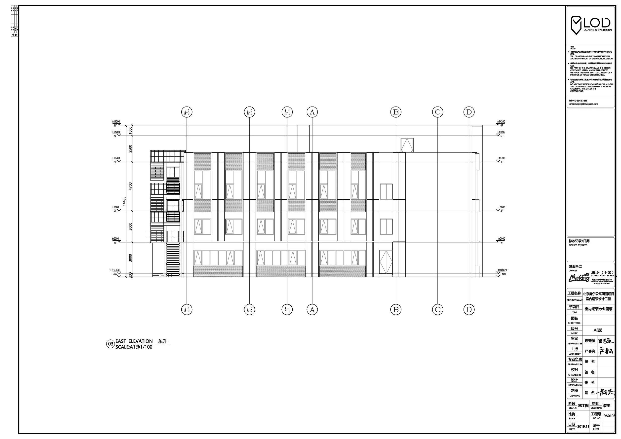
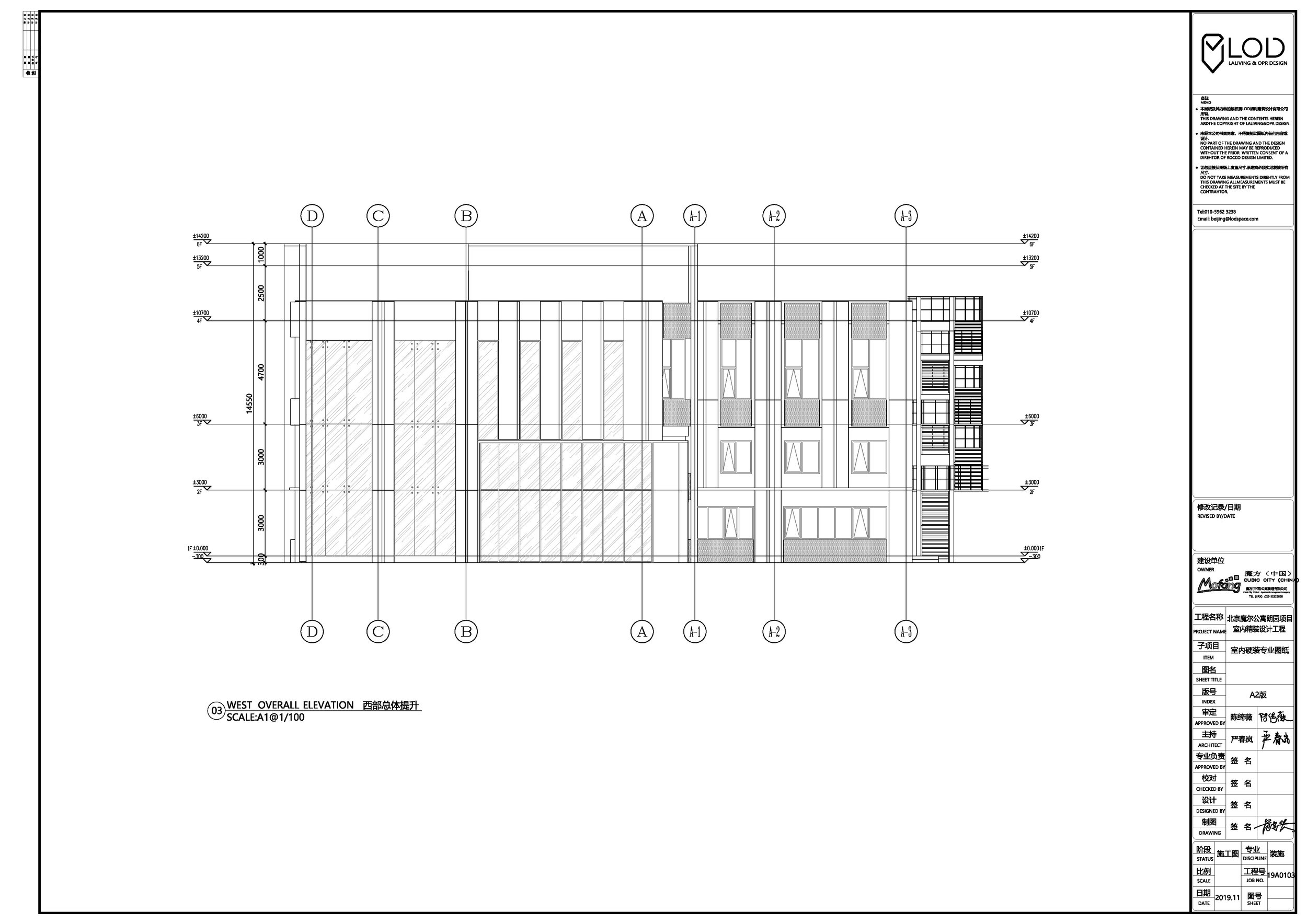
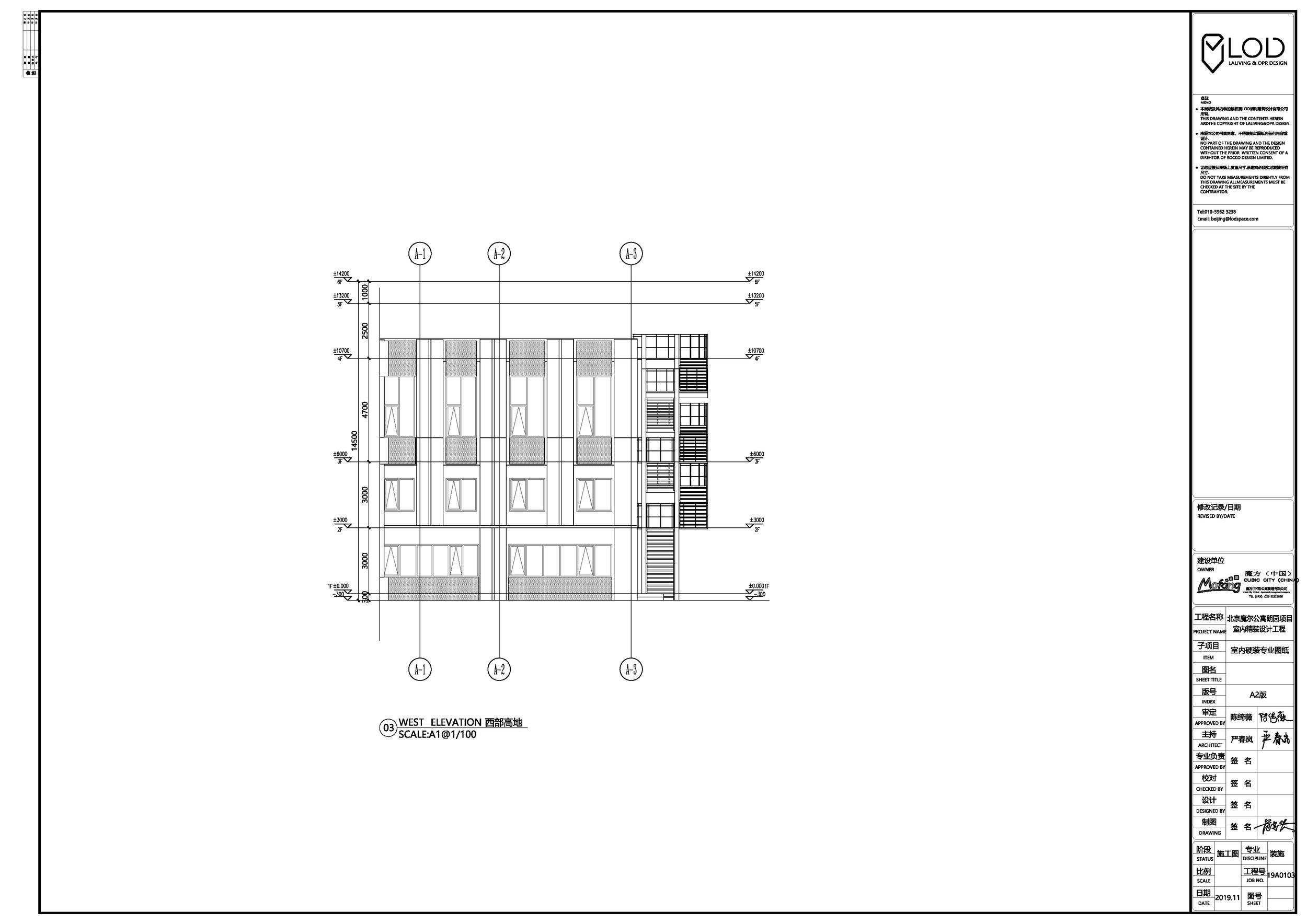
The building is a L-shaped structure with two buildings connecting together. Through various studies of facade modifications the design has utilized a weaving strategy to establish vertical and horizontal components to compose the final facade design, incorporating the new steel exit stairs and split air conditioners units enclosed by perforated steel panels. The vertical components made in precast glass reinforced concrete are curved and create interesting shadows during different times of the day. The horizontal components consist of the window units and the perforated metal panels. The vertical and horizontal weave together in different ratios and proportions at different levels. Main entrance facade at the corner has a new portal design and a double height lobby to signify the entry to the building. Signage design has also been considered as part of the facade. The color of the facade is mostly in grey texture paint with perforated metal panels in charcoal grey color in contrast.
Landscape
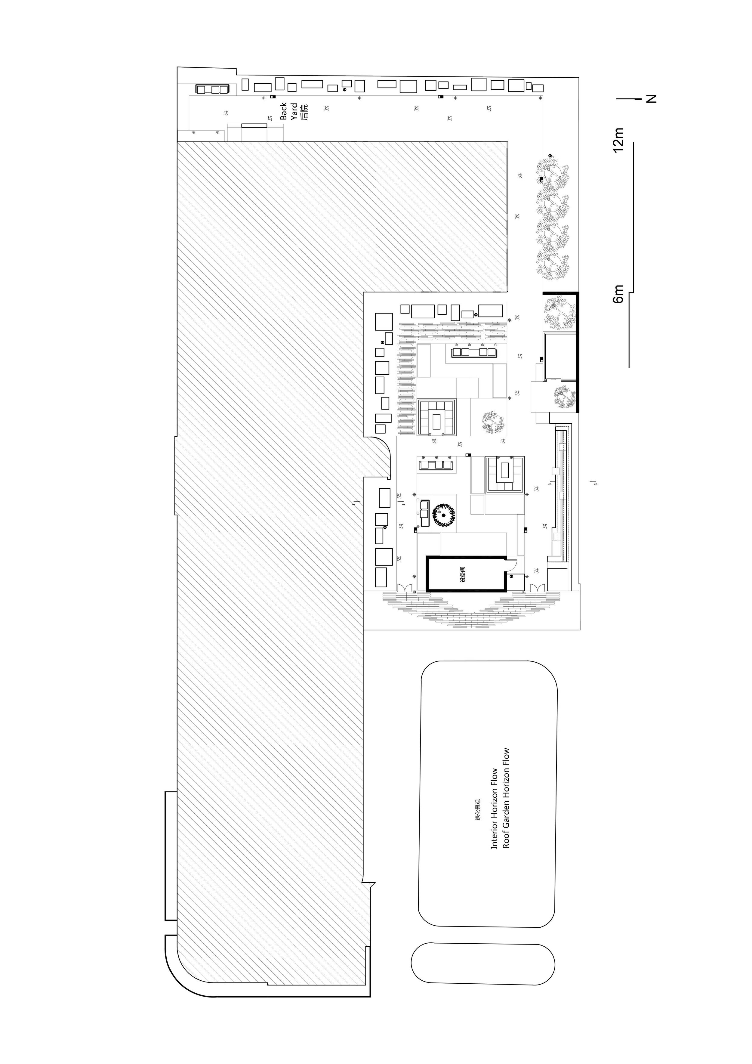
The project has a landscape courtyard enclosed by the L-shaped building and neighboring fence wall. The landscape design uses plants, gravels and different paving materials to create a variety of landscape zones and stepping terraces for the various functions and leisure activities for the residents. The courtyard will also be open to the Langyuan community as part of the response to the "Communitopia" idea of the project.
Public Space Design
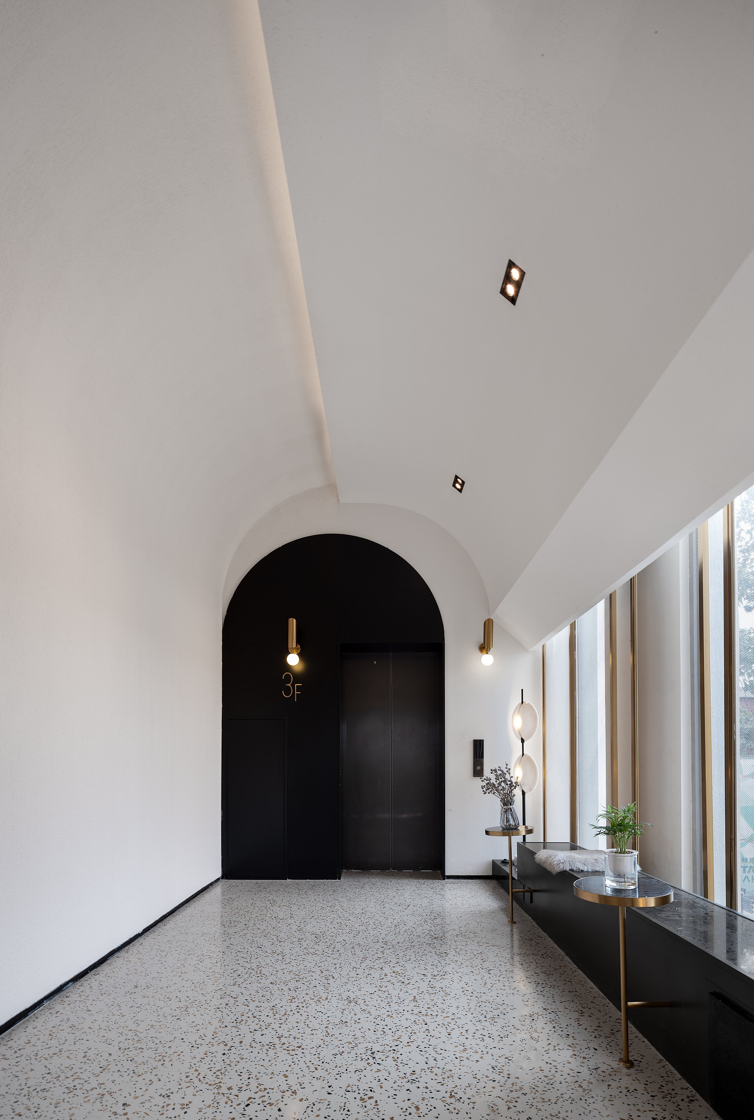
The public space for the Langyuan project is about 220m2. The interior concept focuses on unification of spatial function and design style. The use of arch and arc weaken the division of space, connect all functional areas together and form a feature in the design. Spatial planning emphasizes openess and inter-connectivity. The overall layout is a large open area with multiple functional modules including reception, leisure lounge, bar, gym, laundry room, waiting area, etc. These spaces are intended to be both social and multi-functional, and can be used for ephermeral activities such as road shows, forums and event functions.
Room Unit Design
The room interior is in retro style with featured curved design. Arch and arc are used in fixed furniture, soft furnishings and overall design modeling to reinforce connection between spaces. The color is in warm grey and blue green palettes. The overall soft decoration design is consistent with the interior style, with special attention to comfort and functions.
FF&E
FF&E design is consistent with interior style using soft fabrics and forms to soften the overall feeling of the space, creating a warm atmosphere. The modularity of the furniture design increases the flexibility of the space and intergrate with the fixed components. Lighting is also part of the design features besides functional aspects.
Planning & Drawing
Designer Profile
YIMEI CHAN
Ann Yan
Website: https://www.lodspace.com
