Package 2020 Valentine's day sable chocolate for GODIVA by Sano Minami Design Office
Name of Company or Individual: Sano Minami Design Office
Country: Japan
Website: http://sanominami.com
Project Name: Package 2020 Valentine's day sable chocolate for GODIVA
Project Completion Date: 1/10/2020
Project Completed City: Tokyo
Visual Design Division: Graphic Design
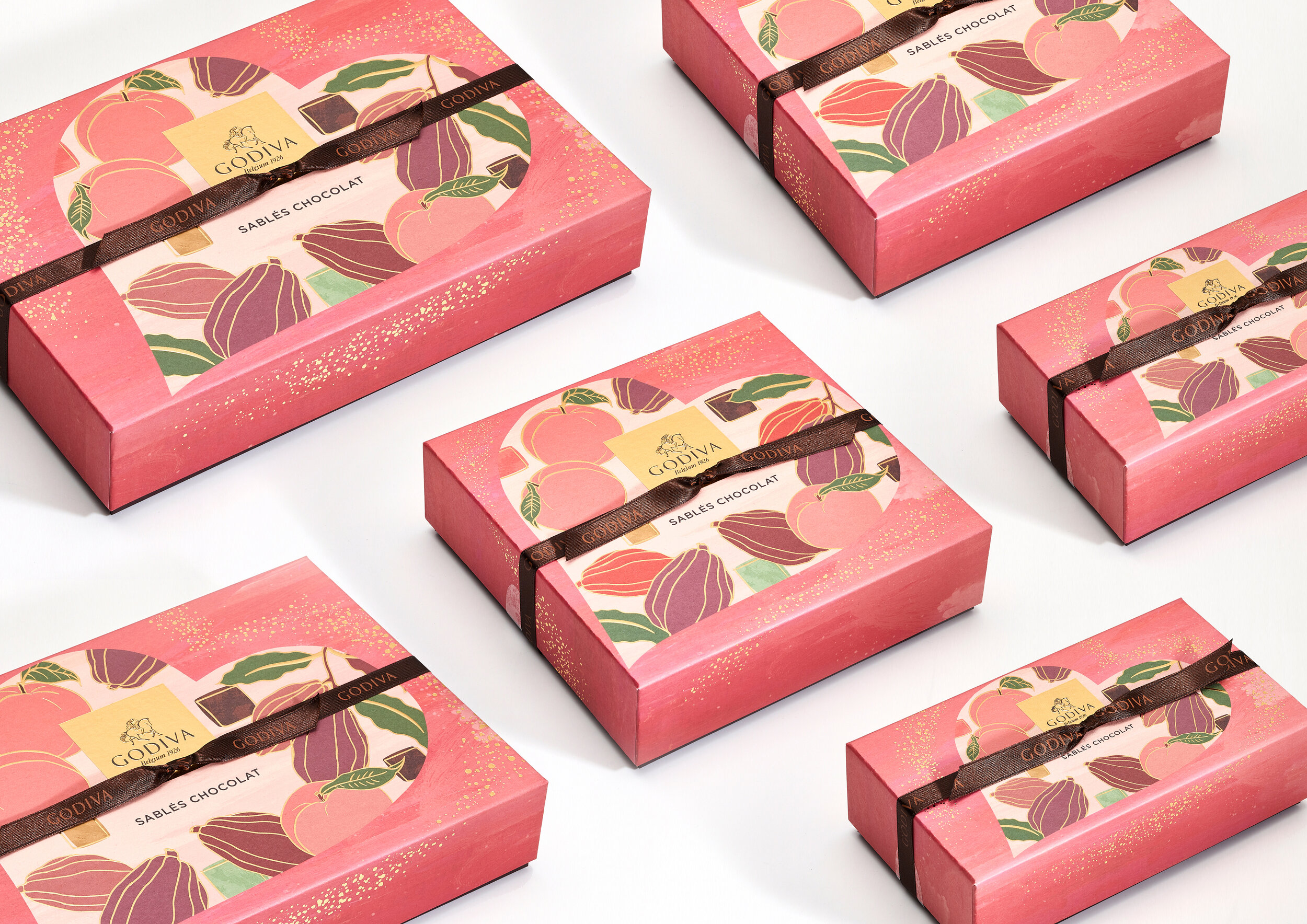
GODIVA 2020 Valentine’s day limited collection
「Sables Chocolat basic Assortment / 3pieces 5pieces 10pieces 15pieces」「Sables Chocolat Cacao % Assortment / 5pieces 10pieces」
Art direction and graphic design.
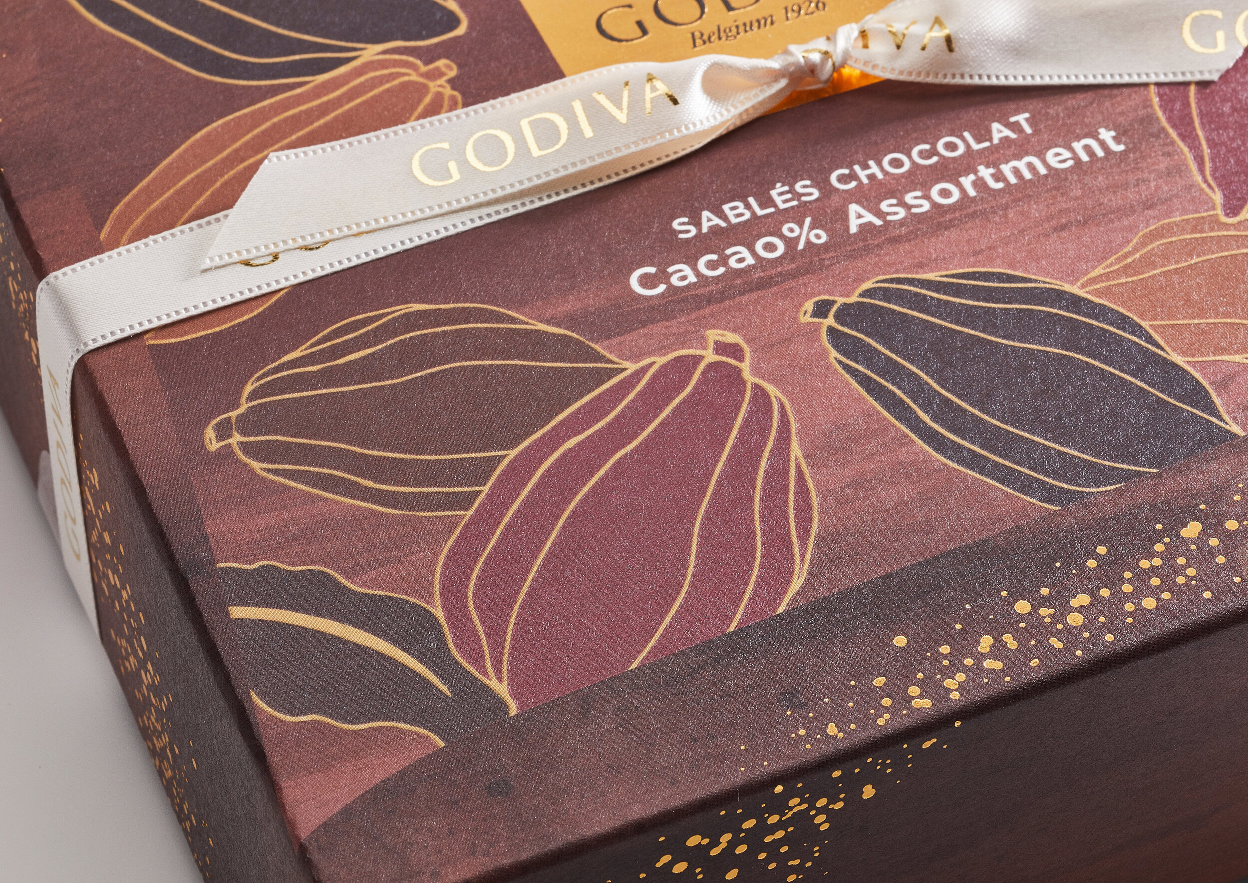
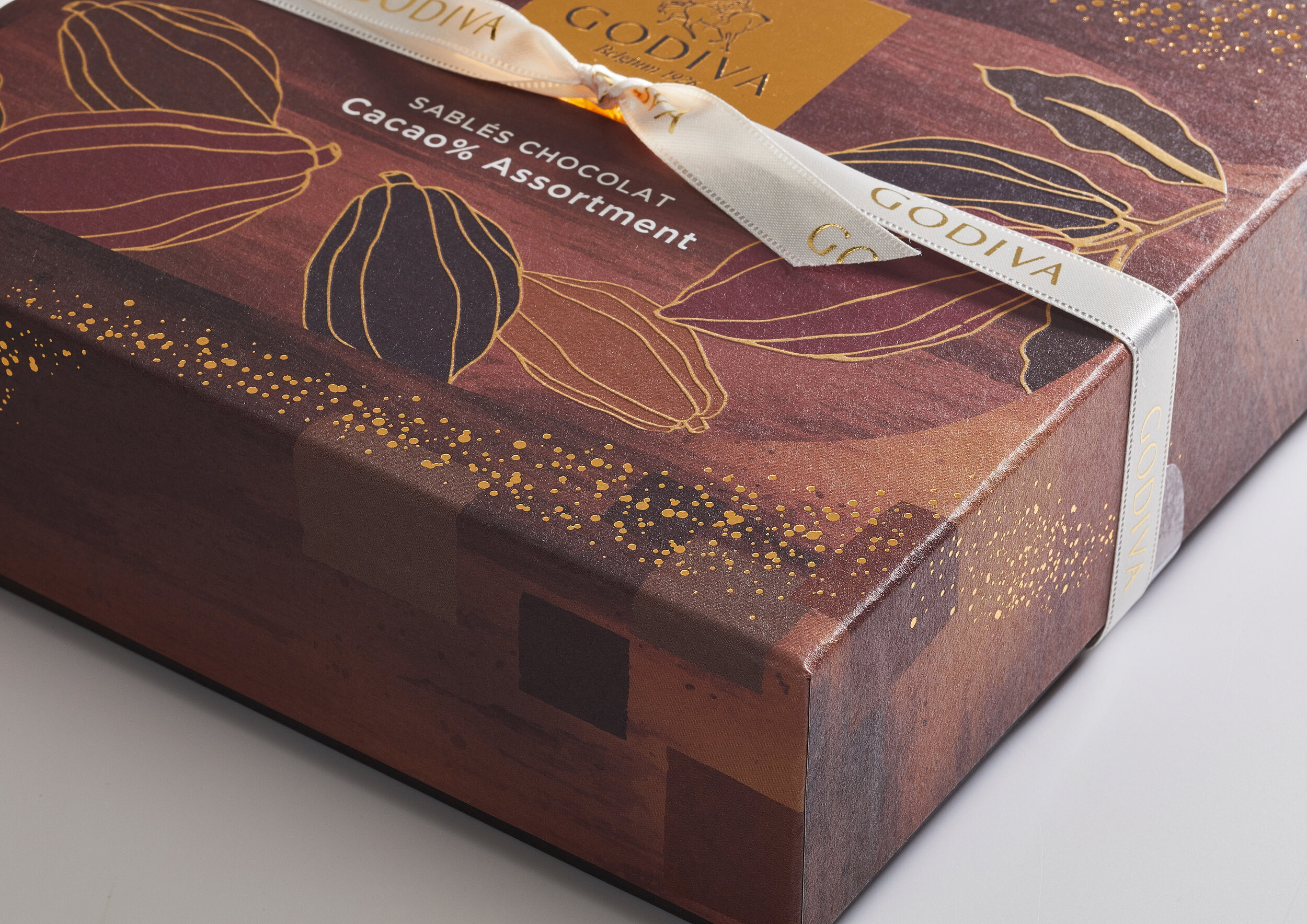
GODIVA 2020 Valentine’s day limited collection
「Sables Chocolat basic Assortment / 3pieces 5pieces 10pieces 15pieces」
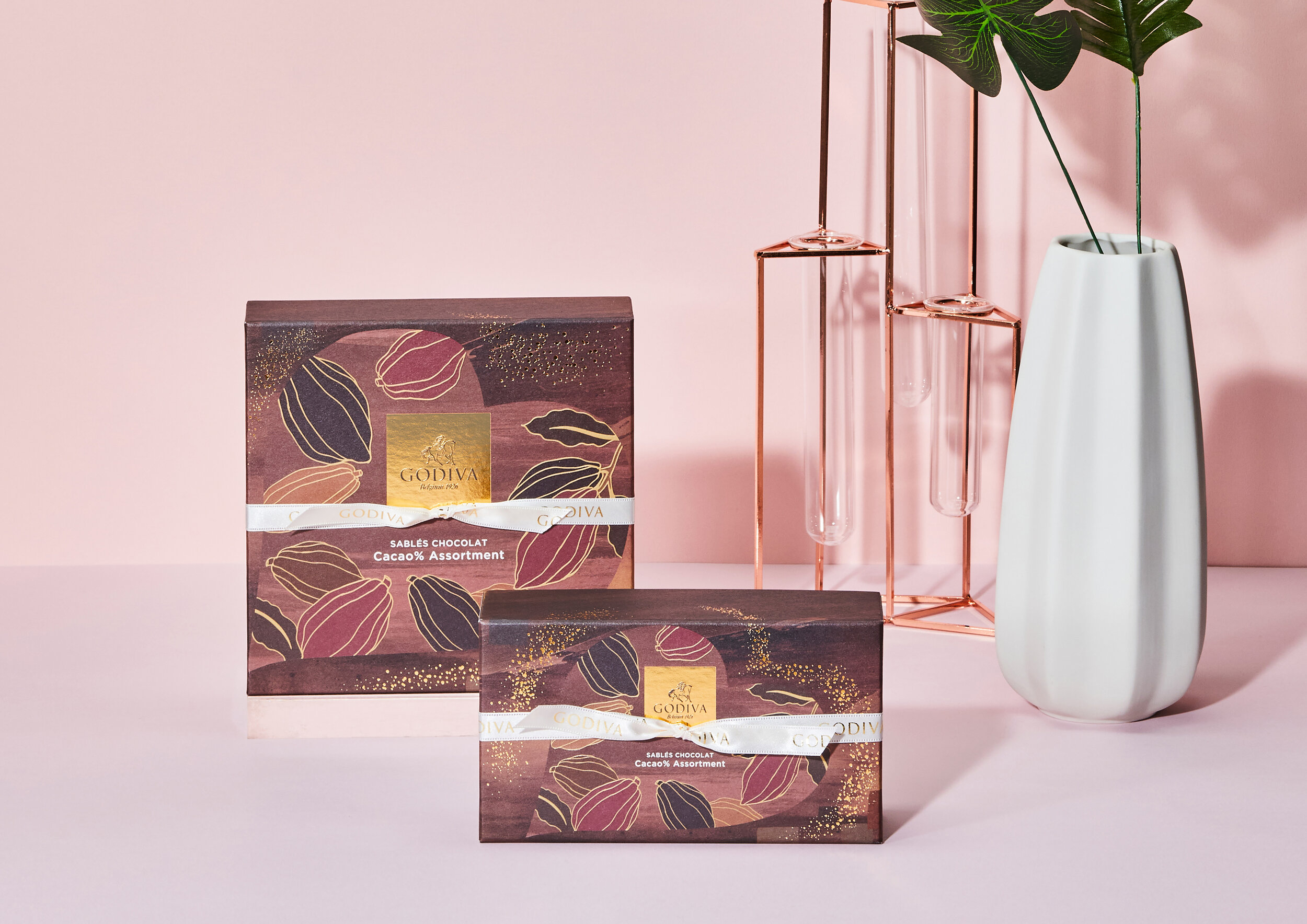
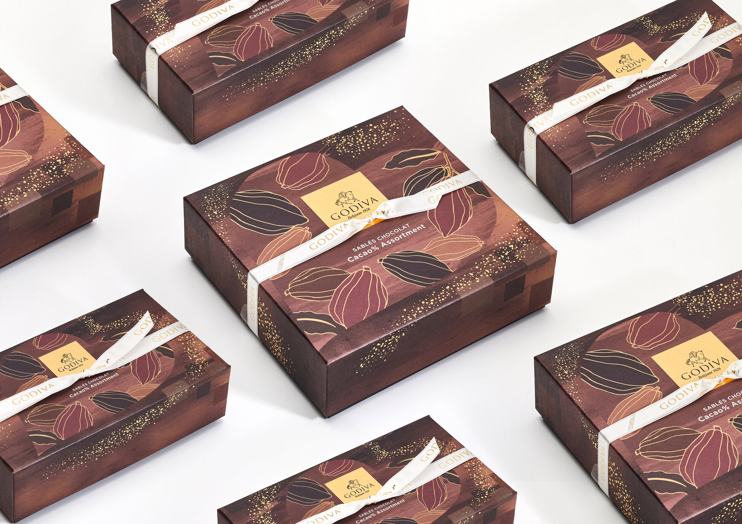
「Sables Chocolat Cacao % Assortment / 5pieces 10pieces」
We did art direction and graphic design.
After press release of GODIVA 2020 Valentine’s day limited collection in Belgian Embassy, these products were available at famous department store, GODIVA store and online store around the country from 1st January.
The most important things for the design through this project was how we express vision of GODIVA and fascination of products through our design in big Valentine’s day marketing.
The design points according to sable series design are as follows.
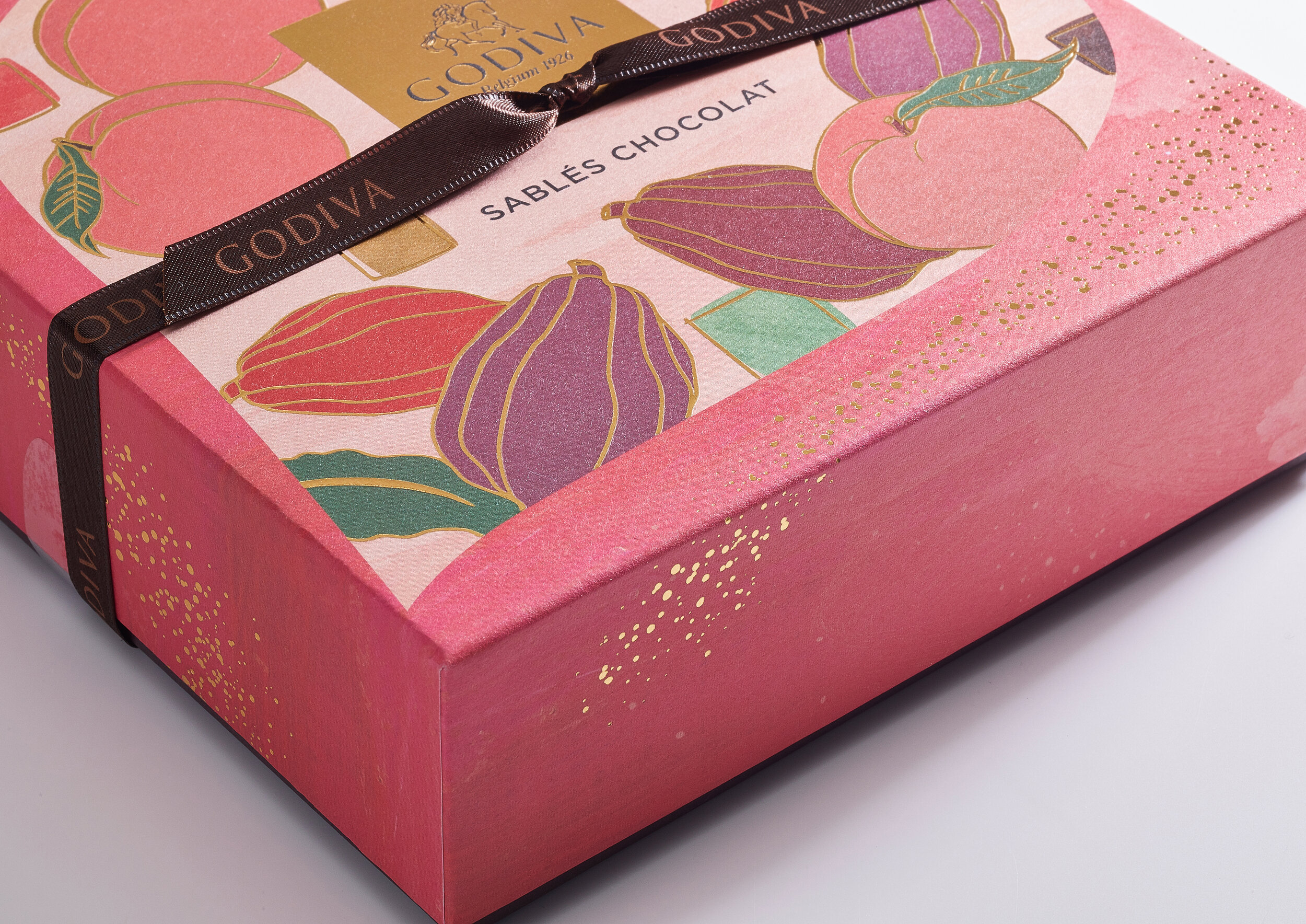
Gold foil represents the excited feeling which you feel at the time when you give a gift to somebody.
The big heart express the special feelings to somebody and special sense of Valentine’ s day.
Like sable, we used the rough paper, gold foil, embossed and varnished coating printing, and elegant illustration.
We made special coating print to use as an accessory case for collection after consumer eat sable cookies.
Water color painting on the back side represents craftsmanship of GODIVA chocolatier .
We were aware of the sense of unity and size of each series.
We designed this product with fruit and cacao illustrations to represent the taste of this product.
The design points according to each sable series are as follows.
* Sables Chocolat basic Assortment*
We expressed a characteristic of the peach flavor in the illustration of the peach with color.
We expressed it is the colorful assortment included in flavor except peach in a colorful square with a sable as a motif.
The color scheme emphasized visual impact.
We added an accent like the chocolate with a color of the ribbon.
* Sables Chocolat Cacao % Assortment *
We represented the various natural colors of cacao in the color scheme and illustrations and minimized the quantity of gold foil and impactful colors compared to the basic line series.
The motif which symbolized the shape of the sable is casually laid out on the side to focus on assortment made with the gradation of the cacao percentage.
The gold ribbon on the white background contrasts with the box to represent elegancy.
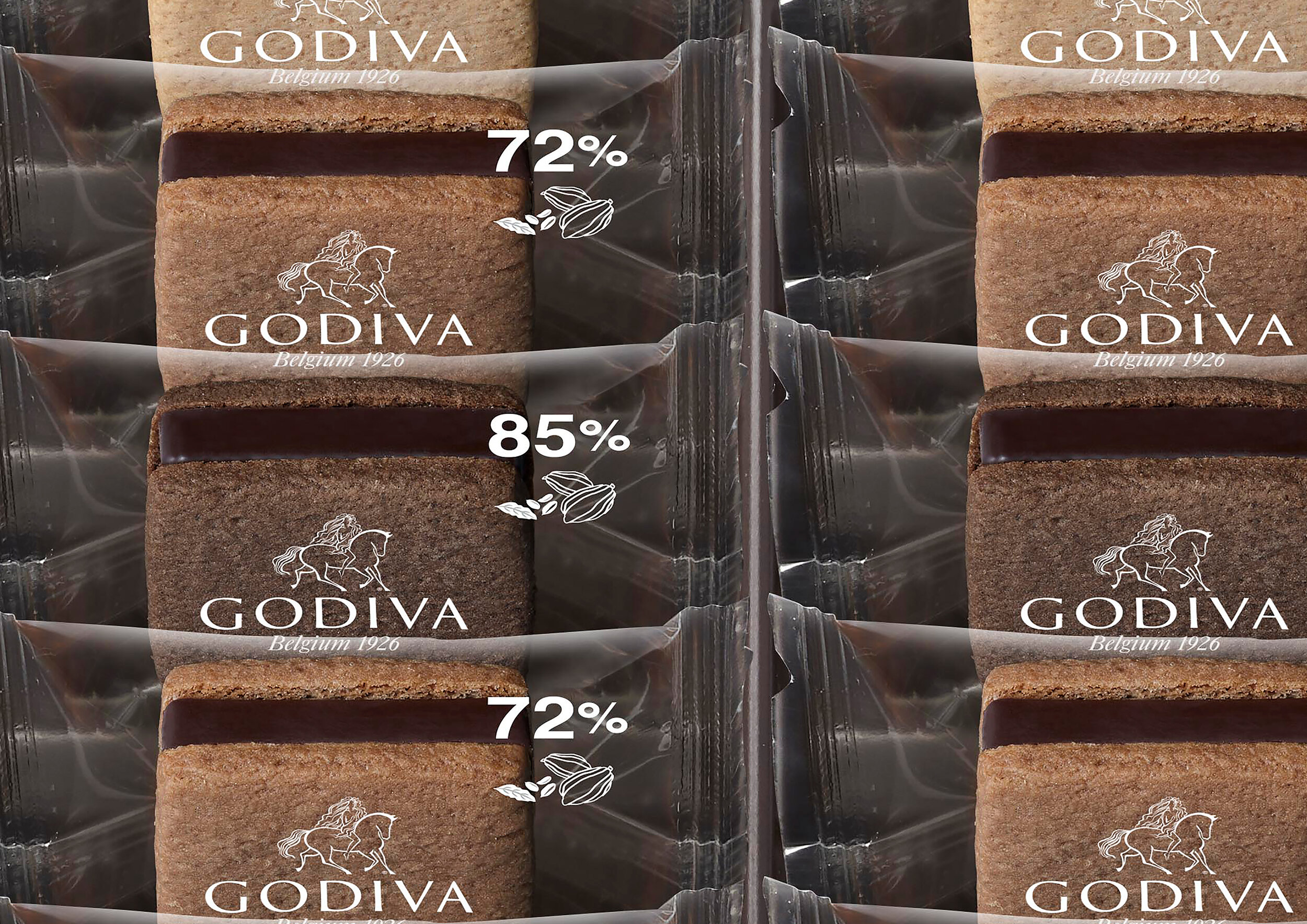
We showed the difference in cacao percentage on the small packing by an illustration and the typography of the cacao.
Finally, we pray our design will brighten people up as we face these difficult times with COVID-19.
